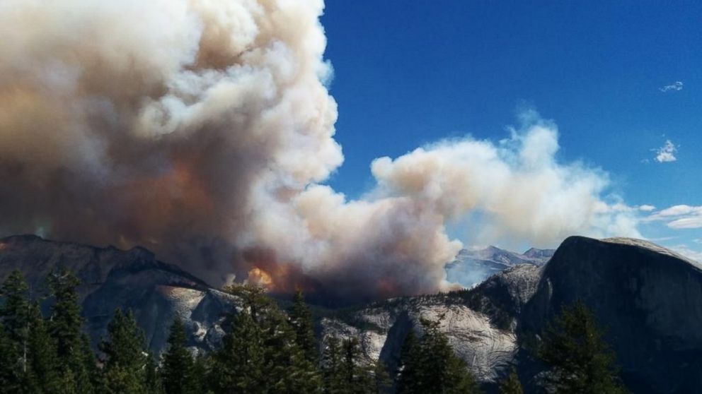
Checking a Yosemite National Park fire map used to be something you did once every few years during a particularly dry summer. Now? It’s basically mandatory trip planning. If you’re heading into the valley or the high country, you’ve gotta know where the smoke is settling. Honestly, there is nothing worse than driving four hours only to find El Capitan buried in a gray haze that smells like a campfire gone wrong.
As of early 2026, the situation in the park is a bit of a mixed bag. We’re coming off a winter that saw some pretty wild weather swings. One week it’s a total blizzard, and the next, it’s bone-dry. That "whiplash" weather, as the experts call it, makes fire behavior in the Sierras super unpredictable.
Why the Map Changes Every Single Hour
Fire maps aren't just static images. They're living data feeds. When you look at an official Yosemite National Park fire map, you’re seeing a combination of satellite heat signatures, reported "puffs" from hikers, and planned burns.
The park uses a "fire-adapted" strategy. This basically means they don't put out every fire. If a lightning strike hits a remote ridge in the high country and it’s not threatening buildings, the rangers might just let it do its thing. Why? Because the forest actually needs it. Decades of putting out every single spark turned the park into a tinderbox. Now, they’re trying to let nature catch up, which means more smoke on the map even when there isn’t a "disaster" happening.
Real-Time Sources You Actually Need
Forget the generic weather app on your phone. It’s useless for wildfire data. If you want the truth about what's burning, you need these specific tools:
- InciWeb: This is the gold standard. If a fire has a name (like the Washburn or the French Fire), it’ll be on here with maps, acreage, and containment percentages.
- NPS Fire and Aviation Map: This is the official Yosemite-specific dashboard. It shows active incidents and, more importantly, prescribed burns.
- PurpleAir: This isn't a fire map, but it’s arguably more important for your lungs. It shows real-time air quality (AQI) from sensors all over the valley and El Portal.
- The Half Dome Webcam: Sometimes the best map is just looking with your own eyes. If the webcam shows a brown sky, the map won't save your hike.
The Prescribed Burn Confusion
You might see a red blob on the Yosemite National Park fire map and start panicking. Hold on. Check the legend. Often, those are "prescribed fires."
Rangers intentionally set these during the "shoulder seasons"—usually late fall or early spring—to clear out the brush. It’s a controlled "good" fire to prevent a "bad" fire later. Recently, there’s been some drama with this. Because of various government funding hiccups and short staffing, some of these critical burn windows were missed. When we miss those windows, the risk for a massive, uncontrollable wildfire in the heat of July goes way up. It’s a high-stakes game of catch-up.
Impact on Your 2026 Trip Plans
The Yosemite National Park fire map isn’t just for safety; it’s for logistics. Fire doesn't just mean "danger"—it means closures.
If there’s an active fire near Wawona, the Mariposa Grove might close. If smoke is heavy in the Valley, the park might implement temporary traffic controls because visibility is shot. We’re also seeing a huge change in how people visit the park this year. With the nonresident annual pass price jumping to $250 and new digital entry systems, you don't want to waste that money on a day when the air is "Unhealthy" on the AQI scale.
The "Natural Firefall" vs. Actual Fire
Don't get the two confused! If you're looking at the map in February, you might hear people talking about "Firefall." That’s the natural phenomenon where the sun hits Horsetail Fall and makes it look like lava.
Funny enough, the park actually scrapped the reservation system for Firefall in 2026. It’s a bit of a free-for-all now. But if you’re looking at a Yosemite National Park fire map and see activity in February, it’s likely a pile burn or a small lightning strike, not the "glow" everyone is photographing.
How to Read the Smoke Plume Layers
Most people just look for the red flame icon. Don't do that. Look for the "Smoke Outlook" or the "Satellite Hotspot" (VIIRS/MODIS) layers.
- Red Dots: These are "thermal anomalies." It could be a massive fire, or it could be a very hot rock or a small spot fire that’s already out.
- Gray Shading: This is the smoke plume. Smoke travels. A fire 50 miles away in the Stanislaus National Forest can ruin your Yosemite trip just as easily as a fire inside the park.
- Containment Lines: Black lines around the perimeter. If the line is solid, the fire is "lined." If it’s dashed, it’s still moving.
Actionable Steps for Your Next Visit
Don't just wing it. If you're heading out, do these three things:
- Download the NPS App: Make sure you toggle the "offline" mode for Yosemite. When you're in the park, you’ll have zero bars, and you won't be able to check the map if a new fire starts.
- Text for Updates: Text YNPTRAFFIC to 333111. It’s primarily for road info, but they blast out emergency fire evacuations or major smoke alerts through that system too.
- Check the "AirNow" Fire and Smoke Map: It combines the fire locations with the smoke plumes in one view. It's much more intuitive for travelers than the technical USGS maps.
Fire is part of the Sierra Nevada. It's been that way for thousands of years. The goal isn't to avoid it entirely—that's impossible—but to be smart enough to navigate around it. Keep that map bookmarked, check it the morning you leave, and always have a "Plan B" hike in case the smoke moves in.