You’ve seen them everywhere. They're on coffee mugs, tattooed on ankles, and plastered across "zen" yoga studios from Los Angeles to Berlin. But honestly, most of those yin and yang images you see online are actually flipped, rotated, or just plain wrong. It’s kind of funny when you think about it. We take this ancient Chinese symbol—the Taijitu—and turn it into a trendy aesthetic without realizing it’s basically a map of how the entire universe functions.
The symbol isn't just a cool black-and-white circle. It’s a dynamic representation of Dualism. If you look at the history, these images were meant to describe how seemingly opposite forces are actually complementary and interconnected. Think about it. You can't have a shadow without light. You can't have "high" without "low." It’s all about the flow.
What's Actually Happening Inside the Circle?
Most people call it the yin-yang. In China, it’s the Taijitu. It literally translates to "Diagram of the Supreme Ultimate." That sounds intense, right? It’s because the philosophy behind it—Taoism—suggests that everything in existence comes from a single starting point, which then splits into these two primary energies.
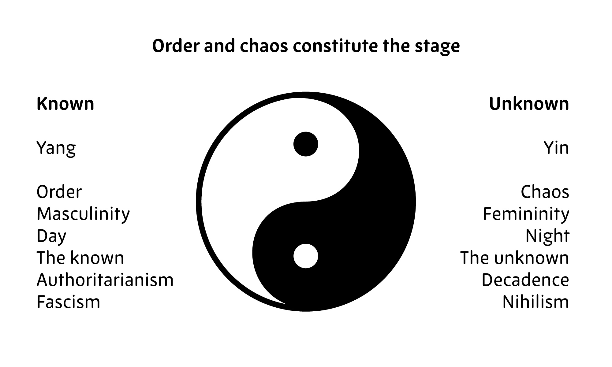
The white side is Yang. It’s the sun. It’s heat, action, masculinity, and the "hard" side of life. Then you have Yin, the black side. That’s the moon, coolness, rest, femininity, and the "soft" side. But here is the kicker: the little dots. The white dot in the black swirl and the black dot in the white swirl. They’re there to remind us that nothing is ever 100% one thing. Even in the deepest darkness of winter (pure Yin), the seed of summer (Yang) is already starting to grow. It’s a cycle. A constant, never-ending wiggle.
The Correct Orientation Matters (Seriously)
If you go searching for yin and yang images, you’ll find a thousand different versions. But traditionally, there’s a specific way it should look. Usually, the "head" of the white Yang section should be at the top, and the "head" of the black Yin section at the bottom. Why? Because Yang is associated with the sky and rising heat, while Yin is associated with the earth and descending water.
If you see an image where the colors are reversed or the dots are missing, it’s technically not a Taijitu. It’s just a graphic. In authentic Taoist art, the "S" curve separating the two halves isn't just a line. It represents the "Great Pole" or the boundary where one force transitions into the other. It’s supposed to look like it’s spinning. If it looks static, it's missing the point.
The History Nobody Mentions
We tend to think this symbol has been around forever in its current form. That’s actually a myth. While the concepts of Yin and Yang go back thousands of years—appearing in the I Ching (the Book of Changes) around the 9th century BCE—the swirling circle we recognize today didn't really show up until much later.
Earlier versions looked way different. Some were just concentric circles. Others were basically stacks of solid and broken lines (trigrams). It wasn't until the Song Dynasty (960–1279 AD) that scholars like Zhou Dunyi started popularizing the diagrams that eventually evolved into the modern yin and yang images we recognize. He used it to explain how the universe moves from stillness into motion.
It Isn't Good vs. Evil
This is the biggest mistake people make. Western culture loves a "Good vs. Evil" narrative. Star Wars. Lord of the Rings. Light side vs. Dark side. But in Chinese philosophy, Yin isn't "bad" and Yang isn't "good."
Imagine you’re a farmer. Yang is the sun you need to grow your crops. Great! But too much Yang is a drought. You’ll starve. Yin is the rain. You need it to survive. But too much Yin is a flood. You’ll drown. Balance isn't a static 50/50 split like a budget spreadsheet; it’s a dance. Sometimes you need more rest (Yin), sometimes you need more hustle (Yang). The "best" state is being able to shift between them as the situation demands.
How Modern Science Actually Backs This Up
It sounds like ancient mysticism, but the logic inside yin and yang images actually mirrors a lot of what we see in modern physics and biology. Take a look at your own nervous system. You have the Sympathetic nervous system (Yang) which is your "fight or flight" mode. Then you have the Parasympathetic nervous system (Yin) which is "rest and digest."
If you’re always in Yang mode, you burn out. Your cortisol spikes, your heart rate stays high, and you eventually crash. If you’re always in Yin mode, you become stagnant and depressed. Health is the ability of your body to oscillate between these two poles.
Even in physics, look at wave-particle duality. Light behaves like a wave and a particle. It's two seemingly contradictory things existing at the exact same time. Niels Bohr, the Nobel Prize-winning physicist, was so obsessed with this connection that he actually chose the Yin-Yang symbol for his coat of arms when he was knighted. He saw that the "complementarity" in quantum mechanics was exactly what the Taoists were talking about centuries ago.
Why Your Home Decor is Probably "Off"
A lot of people use yin and yang images in Feng Shui to "balance" a room. But here’s the thing: you don’t just slap a sticker on the wall and call it a day. Feng Shui experts like Lillian Too or Master Pun-Yin talk about the actual energy of the space.
If your bedroom is full of bright lights, loud colors, and a big TV, it’s too Yang. You won't sleep well. You need to introduce Yin—softer fabrics, dimmer lights, maybe some darker colors. Conversely, if your office is dark, cramped, and quiet, you might find yourself feeling unmotivated. You need some Yang energy—natural light, plants, or even just some upbeat music. The symbol is a reminder to look at your environment and see what’s missing, not just a decoration to hang over the sofa.
Common Misconceptions to Avoid
- The Colors: While black and white are standard, you’ll sometimes see red and black or green and white. These aren't necessarily "wrong," but they change the elemental meaning (red is Fire, green is Wood).
- The Direction: Clockwise or counter-clockwise? Most traditional images show a clockwise "spin." This represents the natural order of the seasons.
- The Shape: It has to be a circle. The circle represents the Wuji—the infinite, empty state before the universe began. Without the circle, the two halves lose their container.
How to Choose the Right Image for Your Intent
If you're looking for yin and yang images to use for a project or a tattoo, don't just grab the first one on a stock photo site. Think about what you’re trying to say.
If you want to represent healing, look for images that have a "soft" transition between the colors. If you’re looking for something that represents martial arts (like Tai Chi), you might want a version that feels more dynamic, with the "heads" of the swirls clearly defined and "pushing" into each other.
Also, pay attention to the surrounding elements. Sometimes you’ll see the Yin-Yang surrounded by eight groups of lines. These are the Bagua trigrams. They represent the eight fundamental principles of reality: Heaven, Earth, Thunder, Wind, Water, Fire, Mountain, and Lake. Adding these makes the image way more specific and complex. It's like going from a basic map to a 3D topographic model.
Actionable Steps for Using Yin-Yang Principles
Don't just look at the pictures. Apply the logic.
- Audit your energy levels. Are you currently in a "Yang" phase of life (grinding, working, busy) or a "Yin" phase (recovering, thinking, waiting)? Stop fighting the phase you're in. If it’s winter, don't try to force the flowers to bloom.
- Check your workspace. If you’re feeling stuck, look for yin and yang images that inspire movement. Or better yet, physically change your space. Open a window (Yang) or put on a heavy sweater (Yin).
- Verify the source. Before you buy art or get a tattoo, check the orientation. Ensure the dots are present and the "S" curve is smooth.
- Practice "Middle Way" thinking. When you find yourself in a heated argument (high Yang), try to find the "dot" of truth in the other person's perspective. It’s the fastest way to de-escalate tension.
The beauty of these images is that they aren't just art. They're a cheat code for understanding why life feels chaotic sometimes. It’s not that things are falling apart; they’re just shifting into their opposite state. Once you get that, you stop stressing about the "black" parts of the circle, because you know the "white" part is already on its way back around.
Check the alignment of any digital assets you're using. If the white is on the bottom and the black is on top, you're looking at a symbol of "stagnation" according to some traditional interpretations. For a symbol of "growth" and "harmony," ensure the light is rising from the bottom-left or situated at the top-right. Using the correct version of yin and yang images ensures you're respecting the philosophy behind the aesthetic.


