You’re staring at a screen. A popup just appeared, asking if you want to "Discard changes?" One button is a red "X," the other is a green checkmark. Your brain stalls for a micro-second. It’s a tiny hesitation, but in the world of user experience, that’s a failure. Yes and no icons are supposed to be the universal language of the web, but honestly, we’ve made them incredibly confusing.
Designers love to get fancy. They swap out a simple "Check" for a "Plus" or a "Thumbs Up," thinking it adds personality. It doesn't. It adds cognitive load. When you’re rushing to finish a task, you don't want to decode a brand's unique visual language; you want to know which button isn't going to delete your last three hours of work.
The Psychology Behind the Check and the Cross
Why do we even use these specific symbols? The checkmark—or the "tick" if you’re in the UK—actually has roots that go back to ancient Rome. During census taking, they’d use a "V" for veritas, meaning truth. Over time, as people got lazier and pens moved faster, that "V" morphed into the lopsided flick we recognize today. It’s deeply baked into our collective psyche as "correct" or "done."
The "X" is a different beast altogether. In Western cultures, it’s a hard stop. It’s the universal sign for "incorrect" or "cancel." But here’s where it gets messy: in some Eastern cultures, specifically in parts of Japan, a circle (maru) is the "yes," while the "X" (batsu) remains the "no." If you’ve ever played an older PlayStation game imported from Japan, you might remember that the "O" button was "Select" and "X" was "Back." This flipped when the consoles moved to the US and Europe because our brains are wired differently regarding those specific yes and no icons.
Color Theory vs. Color Blindness
Red means stop, green means go. It’s simple, right? Except for the roughly 8% of men and 0.5% of women with color vision deficiency (CVD). To someone with deuteranopia, a red "X" and a green checkmark can look like two brownish blobs that are nearly indistinguishable.
If you rely solely on color to communicate "yes" or "no," you’re essentially locking the door on millions of users. This is why shape is actually more important than hue. A heavy, bold "X" creates a visual intersection that signals a barrier. A checkmark has a distinct asymmetrical weight that feels like a forward motion. You need both. Honestly, if your icons can't communicate their meaning in grayscale, your design is broken.
When Yes and No Icons Go Terribly Wrong
We've all seen the "dark patterns." This is when a company uses yes and no icons to trick you into signing up for a newsletter or staying subscribed to a service. You’ll see a giant, glowing green checkmark next to "Keep my subscription," and a tiny, faded, gray "X" next to "I want to save money and leave." It’s manipulative.
But sometimes it’s just bad design rather than malice. Consider the "Delete" confirmation.
- Option A: A red "X" for "No, don't delete" and a green check for "Yes, delete."
- Option B: A gray "Cancel" and a red "Trash" icon.
Option A is a nightmare. Does the red "X" mean "Stop the deletion" or does it mean "No, I don't want this file anymore"? Users have to stop and think. Whenever a user has to think about the icon rather than the action, you’ve lost the battle.
The Rise of the Toggle Switch
In mobile UI, we’ve seen a massive shift away from static icons toward the toggle. You know the one—the little pill-shaped slider that turns green when you flick it right. It’s become the modern equivalent of yes and no icons. It feels tactile. It feels like a light switch.
However, toggles bring their own set of problems. Is it "On" because the slider is on the right, or is the text next to it telling you what will happen if you click it? Nielsen Norman Group, the gold standard for UX research, has pointed out that toggles should provide immediate results. If you have to hit a "Save" button after flipping a switch, you shouldn't be using a toggle. You should be using a checkbox.
The Material Design and Human Interface Impact
Google’s Material Design and Apple’s Human Interface Guidelines have basically dictated how we perceive these icons for the last decade. Google leans heavily into the "Check" for confirmation, often pairing it with a circular background to signify a completed action. Apple, on the other hand, is the king of the "Done" text button, but they use the "X" almost exclusively for "Close" or "Clear."
When these two giants disagree, the rest of the internet gets confused. For instance, look at how "Close" icons are handled in modals. Sometimes the "X" is in the top right. Sometimes it’s a "Cancel" button in the bottom left. There is no true "standard," which is why sticking to the most basic, boring yes and no icons is usually the smartest move for accessibility.
Why "No" is Harder to Design Than "Yes"
The "No" action is inherently negative. It’s a rejection. In a world of "engagement metrics," companies are terrified of the "No." This is why we see "Yes" icons that are animated, bouncing, and colorful, while "No" icons are hidden or made to look like they aren't even clickable.
But a clear "No" is a sign of respect for the user. It builds trust. When a user can easily find the exit or the "Decline" button, they feel in control of the experience. A transparent interface always beats a "sticky" one in the long run.
Real-World Applications You Probably Missed
It's not just about apps. Think about voting ballots. In the 2000 US Election, the "Butterfly Ballot" in Florida became a case study in how bad iconography and layout can literally change world history. The arrows (which acted as yes and no icons for specific candidates) didn't align clearly with the punch holes. People thought they were voting for Al Gore but were actually punching the hole for Pat Buchanan.
In medical software, the stakes are just as high. A nurse or doctor looking at a screen needs to know—instantly—if a patient has an allergy. A green checkmark next to "Penicillin" could mean "Yes, they are allergic" or "Yes, it's safe to give." This is why the industry has largely moved away from simple icons in favor of high-contrast text labels paired with redundant symbols (like a warning triangle).
Practical Steps for Implementing Icons
If you're building a site or designing an app, don't overthink it. Seriously.
- Prioritize Text Labels: Never use an icon alone if you have the space. A checkmark is good. A checkmark with the word "Submit" is better. A checkmark with the word "Confirm Order" is best.
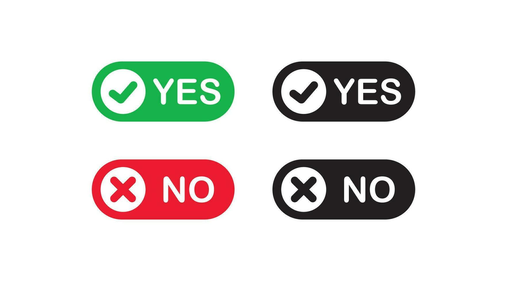
- Use Universal Shapes: Stick to the standard check and the "X." This isn't the place to show off your illustration skills.
- Contrast is King: Ensure your icons have a contrast ratio of at least 3:1 against the background to meet WCAG 2.1 AA standards. For smaller icons, 4.5:1 is even better.
- Test in Grayscale: Turn off the color on your monitor. If you can’t tell which button is "Yes" and which is "No," go back to the drawing board.
- Placement Matters: In Western cultures, "No" or "Cancel" usually goes on the left, and "Yes" or "Action" goes on the right. This follows the natural flow of "Back" and "Forward."
How to Choose Your Icon Set
When picking a library like FontAwesome, Heroicons, or Lucide, look at the weight of the strokes. Are they consistent? If your "Yes" icon is a thin, wiry checkmark and your "No" is a thick, chunky "X," the visual hierarchy will be skewed. The user's eye will naturally jump to the heavier object, regardless of what it means.
Consistency across your entire platform is the only way to prevent user fatigue. If an "X" means "Delete" on one page and "Close window" on another, you’re training your users to be hesitant. That hesitation is exactly what leads to accidental clicks and frustration.
Final Insights on Meaningful Icons
We often treat icons as decorations, but they are actually functional tools. They are the road signs of the digital world. You wouldn't want a "Stop" sign to be a pretty shade of purple or shaped like a cloud just because it "fit the aesthetic" of the neighborhood.
The best yes and no icons are the ones you don't even notice. They facilitate a flow so smooth that the user feels like they are thinking the actions into existence rather than clicking buttons. To get there, you have to embrace the boring. Use the symbols people already know. Respect their color limitations. Above all, make sure that when a user wants to say "No," you aren't making it a chore to find the exit.
Stop trying to reinvent the checkmark. It's been working for two thousand years; your "innovative" new icon probably won't beat it. Focus on clarity, accessibility, and honest communication. That is how you build an interface that people actually enjoy using.
Next steps for your project: Audit your current interface by viewing it through a color-blindness simulator like Coblis. Identify every instance where a "Yes" or "No" action is represented by an icon alone. Replace those instances with a combination of a standard icon and a clear, descriptive text label. Verify that the "Cancel" or "No" action is visually distinct from the primary "Action" button to prevent accidental clicks.