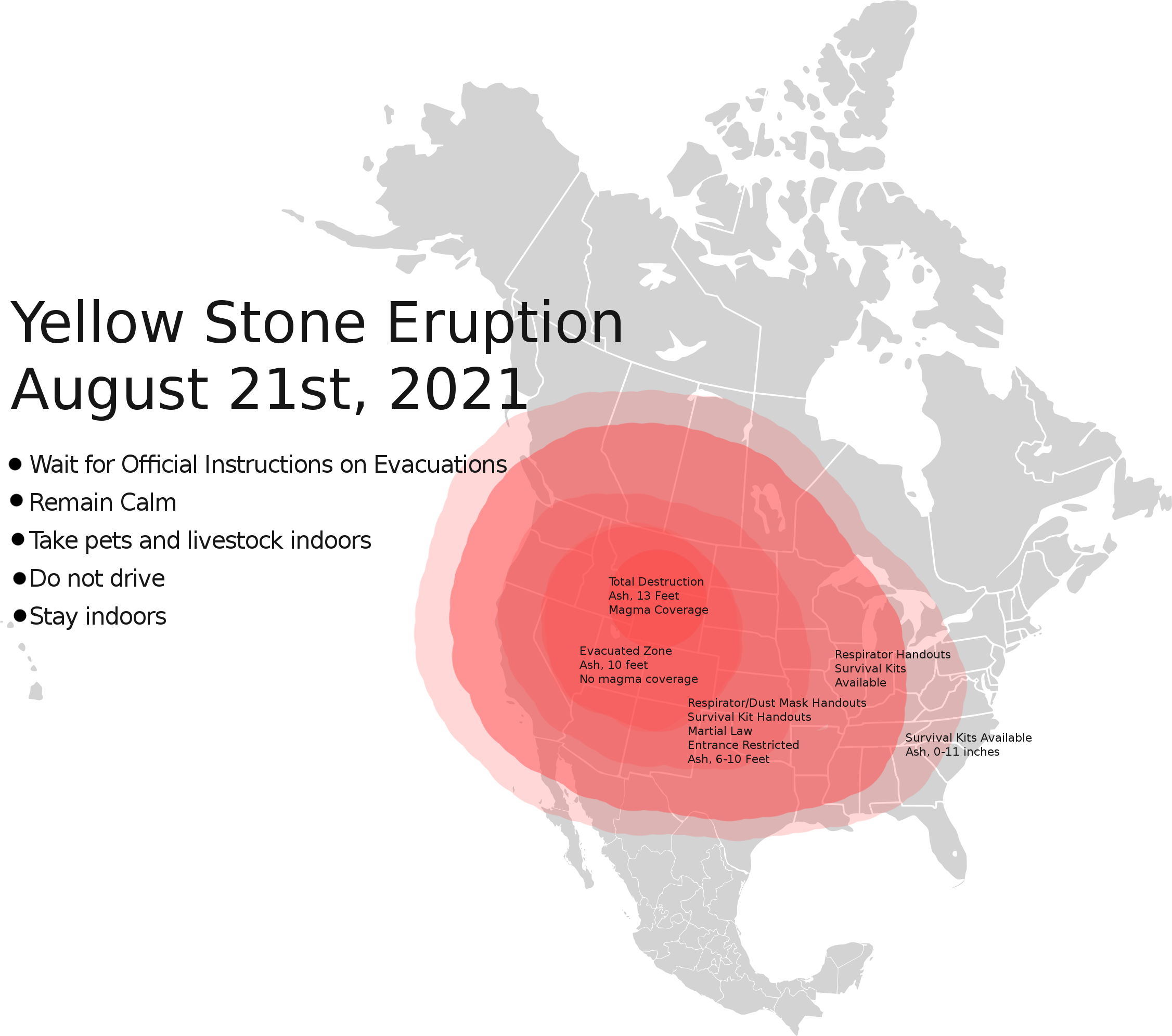
Honestly, if you spend ten minutes on social media, you’d think Yellowstone was a ticking time bomb ready to erase the United States by lunch tomorrow. People love a good apocalypse story. They post these terrifying, neon-red graphics labeled Yellowstone volcano eruption map, showing ash smothering every single state from Washington to Florida. It makes for great clickbait. It’s also mostly wrong.
If you actually look at the geological data from the United States Geological Survey (USGS), the reality is way more nuanced and, frankly, a lot less like a Michael Bay movie. Yellowstone is a restless giant, sure. It breathes. The ground rises and falls. Geysers like Steamboat erupt unpredictably. But the map of a potential future eruption isn't just one giant circle of doom. It’s a complex puzzle of wind patterns, eruption volumes, and physics.
We need to talk about what those maps actually represent and why the "big one" is the least likely thing to happen in our lifetime.
The Map That Actually Matters
When scientists at the Yellowstone Volcano Observatory (YVO) look at a Yellowstone volcano eruption map, they aren't usually looking at the "End of the World" scenario. They’re looking at the past. The history of the Yellowstone hotspot is written in the dirt across Idaho and Wyoming. If you trace the path of previous massive eruptions, you see a trail of calderas stretching back 17 million years.
Most people don't realize that the "supervolcano" hasn't just stayed in one spot. The North American tectonic plate is sliding over a stationary mantle plume. It’s like sliding a piece of paper over a candle. The "burn marks" are the old volcanic centers.
The three most famous "big" eruptions happened 2.1 million, 1.3 million, and 631,000 years ago. If you map those out, you see three overlapping circles. But here is the kicker: the most recent activity hasn't been a massive explosion at all. Since the last big caldera-forming event, there have been about 80 relatively "small" rhyolite lava flows.
If Yellowstone erupts again soon, it’s probably going to be a lava flow that barely leaves the park boundaries. You wouldn't even need a national map for that. You’d need a local trail map.
Modeling the Ash: Where Does It Actually Go?
Let’s talk about the scary stuff because that’s why you’re here. If we did have a "Super-Eruption" (a VEI-8 event), what does the Yellowstone volcano eruption map look like for ash fall?
In 2014, Larry Mastin and his colleagues at the USGS ran a model called Ash3d. They wanted to see how ash would distribute across North America. They didn't just draw a circle. They accounted for the fact that a massive eruption column can actually create its own weather. It doesn't just blow downwind; it pushes out in all directions because the sheer volume of material is so immense.
- The Kill Zone: Within a few hundred miles (think Idaho, Montana, Wyoming), the ash would be several meters thick. It would bury buildings.
- The Breadbasket: In the Midwest (places like Iowa, Nebraska, and Kansas), you’re looking at inches of ash. That sounds small. It isn't. An inch of volcanic ash is heavy, it ruins engines, and it shorts out power grids.
- The Coasts: New York and Los Angeles might see a dusting. Maybe a few millimeters. Enough to disrupt flights and make the sky look weird, but not enough to bury your car.
The map varies wildly based on the time of year. If it happens in winter, the jet stream might pull that ash southeast. In summer? It might drift further north. Basically, the "impact map" is a moving target.
Hydrothermal Explosions: The Stealth Threat
Everyone worries about the magma. Nobody talks about the boiling water.
In July 2024, a small hydrothermal explosion occurred at Biscuit Basin. It sent rocks and steam flying, destroying a boardwalk. This is the kind of event that actually happens on a human timescale. If you were to draw a Yellowstone volcano eruption map for the next ten years, it would be dotted with dozens of potential hydrothermal sites.
These aren't caused by magma reaching the surface. They happen when water gets trapped in a "pressure cooker" environment underground. Suddenly, the pressure drops—maybe because of a small earthquake or a change in the silica cap—and the water flashes to steam.
It’s local. It’s violent. And it’s much more likely to ruin your vacation than a continental ash cloud.
Why the "Overdue" Narrative is Nonsense
You’ve heard it. "It erupts every 600,000 years, and we're at 631,000! We're overdue!"
Geology doesn't work on a schedule. Volcanoes aren't trains. If you average out the three big eruptions, you get a number around 725,000 years, but three data points aren't enough to establish a pattern. It’s like saying, "I had three kids at ages 25, 28, and 32, so I’m 'overdue' for another one at 35." That’s not how biology works, and it’s not how crustal melting works.
The magma chamber under Yellowstone is currently mostly solid. It's a "mush" of crystals and rock. For a super-eruption to occur, you need a huge percentage of that mush to be liquid. Right now, it’s only about 5% to 15% liquid melt. We aren't even close to the conditions needed for a catastrophic event.
The USGS monitors this 24/7. They use GPS to track ground deformation. They use seismometers to listen to the "heartbeat" of the park. If things were actually moving toward an eruption, the Yellowstone volcano eruption map of earthquake swarms would light up like a Christmas tree, and the ground would be bulging by meters, not millimeters.
How to Read a Real USGS Map
If you want to stay informed without the panic, you have to look at the right sources. The USGS uses a color-coded alert system:
- Green (Normal): This is where we are. Typical background activity.
- Yellow (Advisory): Something is up. Maybe a weird earthquake swarm or increased gas.
- Orange (Watch): An eruption is possible or a small one is happening.
- Red (Warning): A significant eruption is imminent or underway.
Most "scary" maps you see online are generated by amateurs using worst-case scenario data from the Lava Creek eruption (the one 631k years ago). They ignore the 80+ smaller events that have happened since. They ignore the fact that the plume might be cooling or that the plumbing system is changing.
What to Actually Prepare For
If you live in the Intermountain West, you shouldn't be prepping for a supervolcano. You should be prepping for the things that actually show up on a Yellowstone volcano eruption map of hazards:
- Earthquakes: Yellowstone sees thousands of them a year. Most are tiny. But a magnitude 7.0 or higher is a real possibility and has happened in recorded history (1959 Hebgen Lake).
- Wildfires: These are an annual threat that displaces more people than the volcano ever has in modern times.
- Hydrothermal events: If you're visiting, stay on the boardwalks. Seriously. The ground is a thin crust over boiling acid.
Actionable Steps for the Curious
Don't let the doom-scrolling get to you. If you want to be a "Yellowstone expert" in your friend group, do these three things:
- Check the YVO Monthly Update: Every month, Mike Poland (the scientist-in-charge) puts out a video on YouTube. It’s calm, factual, and explains every weird shake or steam vent. It’s the best way to debunk fake maps.
- Learn the difference between a "Caldera" and a "Cinder Cone": Understanding the anatomy of the park makes the maps make more sense. Yellowstone isn't a mountain; it's a giant hole in the ground.
- Follow the seismographs in real-time: You can actually go to the University of Utah's seismology website and see the live feed from the park. When you see a "swarm," don't panic. Look at the depth. Most are just the earth settling or water moving.
The "big one" makes for a great movie script. But the real Yellowstone volcano eruption map is a story of a changing landscape, hot water, and a tectonic plate that just keeps on sliding. We aren't "overdue," and the sky isn't falling. It's just geology in action, and it's spectacular to watch from a safe, informed distance.
Next Steps for Staying Informed
- Monitor the official USGS Yellowstone Volcano Observatory (YVO) website for the current alert level and weekly monitoring updates.
- Review the 2014 Ash3d study if you live in the Midwest to understand realistic ash-accumulation risks rather than hyperbolic social media graphics.
- Support geological research by visiting the park and following the National Park Service guidelines to keep these fragile hydrothermal areas intact.