Everyone loves a good apocalypse story. You’ve probably seen those viral maps on social media—huge, terrifying circles of red paint bleeding across the entire United States, claiming that when the "big one" hits, we’re all toast from Seattle to New York. It’s scary. It’s clickable. But honestly? Most of those graphics are total garbage. If you actually look at a scientifically vetted yellowstone volcanic eruption map, the reality is way more nuanced, and frankly, a lot more interesting than just "everyone dies."
Geology isn't a Michael Bay movie.
When people search for a yellowstone volcanic eruption map, they’re usually looking for the "kill zone." They want to know if their house in Denver or Salt Lake City is going to be swallowed by lava. Spoilers: it won't be. Lava flows at Yellowstone almost never leave the caldera. The real "map" we should be talking about is the ashfall distribution, which is a massive, continent-sized headache, but it’s not an instant death sentence for the planet.
What the Real Maps Actually Show
If you head over to the United States Geological Survey (USGS) or look at the work done by the Yellowstone Volcano Observatory (YVO), the maps look nothing like the doom-scrolling infographics.
Real maps of Yellowstone’s past eruptions—like the Huckleberry Ridge eruption 2.1 million years ago or the Lava Creek eruption 640,000 years ago—show footprints of ash. These aren't perfect circles. Wind exists. High-altitude currents, like the jet stream, dictate where the debris goes. In 2014, USGS scientists Larry Mastin and his colleagues ran a model called "Ash3d." They simulated a month-long "super-eruption." The resulting yellowstone volcanic eruption map showed that while the Northern Rockies get buried in meters of ash, places like Miami or New York might only see a dusting thinner than a penny.
It's about thickness, not just coverage.
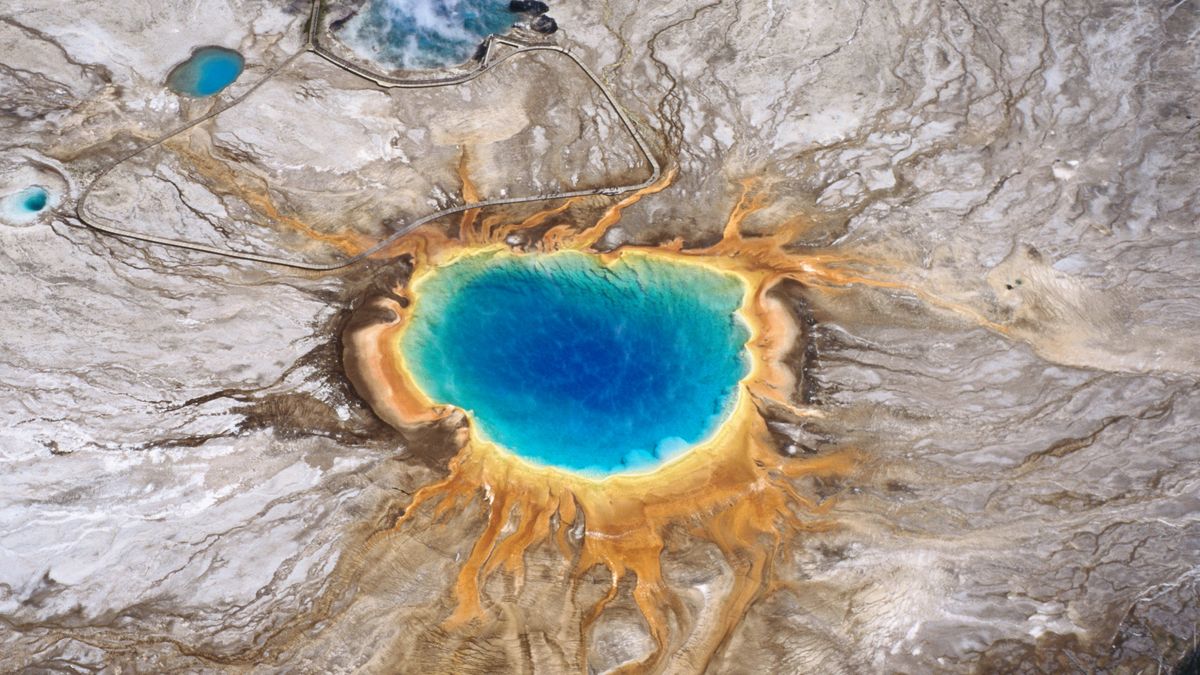
Think about it this way: a map showing where rain falls during a hurricane is useless unless you know if it’s an inch or twenty feet. Most people see a map of the Yellowstone "hotspot" track and assume the whole snake-shaped path through Idaho is still active. It isn't. The "hotspot" is stationary; the North American tectonic plate is what’s moving southwest. The only part of the map that matters for a future eruption is the current caldera in the northwest corner of Wyoming.
The Three Types of Eruptions No One Talks About
We’re obsessed with the "Super-eruption." It’s the "VEI 8" event—the big kahuna. But if you’re looking at a yellowstone volcanic eruption map to predict the future, you’re looking at the least likely scenario.
- Hydrothermal Explosions: These are the most common. They don't involve magma at all. It’s basically a massive steam explosion. Just this past year, Biscuit Basin had a small one. A map of this event would cover maybe a few hundred yards. It can still kill you if you’re standing right there, but it’s not ending civilization.
- Lava Flows: This is what most people picture. But Yellowstone’s magma is rhyolitic—it's thick, pasty, and slow. It doesn't run like the rivers of fire in Hawaii. If a lava flow happened today, it would likely stay within the park boundaries. You could literally outrun it.
- The Big One: The caldera-forming eruption. This is the source of those terrifying maps. Even then, the "ash umbrella" effect means the ash moves in all directions, regardless of the wind, because the eruption cloud is so massive it creates its own weather.
Mike Poland, the scientist-in-charge at YVO, constantly reminds people that the volcano isn't "overdue." Volcanoes don't work on a schedule. If you see a map claiming we're "in the red zone" because it's been 640,000 years, close that tab. It’s pseudo-science.
The Ash Problem is the Real Problem
Let's get practical. If you look at a yellowstone volcanic eruption map focused on ash distribution, the Midwest is the hardest hit. This is the "breadbasket" of America.
A few centimeters of ash might not sound like much, but it’s not like wood ash from a fireplace. It’s microscopic shards of glass and pulverized rock. It’s heavy. When it gets wet, it turns into something with the consistency of wet concrete. It collapses roofs. It shorts out power lines. It wrecks jet engines.
If you live in Omaha or Des Moines, your "map" experience isn't fire and brimstone; it’s your HVAC system failing and your local cornfields being smothered. The maps produced by researchers like Ash3d show that even a massive eruption wouldn't "destroy" the U.S., but it would definitely break the economy for a decade. Communication systems would go haywire. Water treatment plants would clog.
Why the "Ring of Fire" doesn't matter here
People often confuse Yellowstone with the volcanoes in the Pacific Northwest, like Mt. St. Helens or Mt. Rainier. Those are subduction zone volcanoes. Yellowstone is a mid-plate hotspot. The chemistry is different. The maps are different. While a map of a Cascade eruption shows a long, narrow "lahar" (mudflow) path down a river valley, a yellowstone volcanic eruption map is more about a broad, radial dispersal.
Misconceptions That Distort the Map
There’s this weird myth that the ground is rising so fast that an eruption is imminent. It’s called "uplift." Yes, the ground at Yellowstone breathes. It goes up and down by several inches over decades. This is caused by hydrothermal fluids and occasionally small movements of magma miles below the surface.
When you see a "heat map" of Yellowstone showing increased ground temperature, don't panic. The park is literally a giant heat vent. If the ground didn't show heat, that would be the weird part. Most "emergency maps" circulated by conspiracy theorists use satellite thermal data out of context. They point at a bright red spot on a map and say, "Look, it’s melting!" No, that’s just Old Faithful doing its job.
How to Read a Volcanic Map Like a Pro
If you want to find an accurate yellowstone volcanic eruption map, you need to look for specific markers.
- Isopleths: These are the lines on the map that show equal thickness of ash. If a map doesn't have these, it's a cartoon, not a scientific document.
- Caldera Outlines: A real map will show the three distinct calderas from the last 2.1 million years. They overlap like a messy Venn diagram.
- Seismicity Plots: These show where earthquakes are happening. Yellowstone has thousands of "micro-quakes" every year. A map full of dots doesn't mean it’s blowing up; it means the crust is brittle and full of moving water.
Scientists use these maps to monitor "swarms." In 2017, there was a swarm of over 2,400 earthquakes. People freaked out. The maps looked "busy." But the earthquakes were small, and they didn't lead to an eruption. They were just the mountain adjusting.
What Happens if the Map Becomes Reality?
Suppose the worst-case scenario occurs. The USGS has blueprints for this. The first thing that happens isn't a map of ash; it’s a map of "deformation." Satellites (InSAR) and GPS stations would show the ground swelling like a giant blister. This would happen for weeks or months, not minutes.
We would see "earthquake swarms" that migrate. This is the magma actually pushing its way up. A map of these epicenters would show a clear path toward the surface. We are nowhere near that. Right now, the yellowstone volcanic eruption map of current activity is boring. And boring is good.
Practical Steps for the Curious
Don't buy into the "end of the world" hype, but don't ignore the science either. If you’re genuinely interested in the geological footprint of this monster, here is what you should actually do:
- Check the YVO Monthly Update: The Yellowstone Volcano Observatory releases a video and a text report every single month. They show the latest maps of ground movement and quakes. It’s the only source you should trust.
- Learn about Tephra: That’s the scientific name for the stuff that falls from the sky. Understanding tephra helps you realize why "distance from the volcano" isn't the only factor. A town 500 miles away might get more ash than a town 200 miles away because of how the wind curls.
- Distinguish between "Active" and "Erupting": Yellowstone is an active volcanic system. It is not an erupting one. Every map showing "current" activity is showing you the heartbeat of a sleeping giant, not the roar of an awake one.
- Focus on Regional Hazards: If you live in the Intermountain West, your concern isn't the volcano; it’s the earthquakes. Yellowstone is capable of M7+ earthquakes that have nothing to do with eruptions. The 1959 Hebgen Lake quake is a prime example. It killed people and changed the landscape, and the volcano didn't budge.
The most accurate yellowstone volcanic eruption map is one that shows a history of massive events separated by hundreds of thousands of years of silence. We are currently in that silence. The maps we make today are tools for understanding the past and monitoring the smallest shivers of the present. They aren't "wanted" posters for a coming disaster. Stick to the data, ignore the red-circle thumbnails on YouTube, and remember that the Earth usually takes its time.