Look at a purple flower. Now, look away and close your eyes. If you stare long enough, you'll see a ghostly, dancing blob of bright yellow burned into your vision. That’s not a glitch in your brain. It’s physics. Specifically, it’s the way your photoreceptors get tired and leave you staring at the opposite of purple.
Yellow. It’s the color of lemons, caution signs, and sunshine. But in the world of color theory, it’s the aggressive, high-contrast partner that makes purple pop. If you've ever wondered why a Los Angeles Lakers jersey looks so vibrant or why an Easter basket feels "right," it's because these two colors are locked in a permanent, high-stakes battle for your attention.
The Science of Why Yellow is the Opposite of Purple
Color isn't just a feeling; it's math. To find the true opposite of purple, we have to look at the visible light spectrum. Humans see light in wavelengths. On a standard RYB (Red, Yellow, Blue) color wheel—the kind you likely used in elementary school—yellow sits directly across from purple. This makes them "complementary."
But wait. It gets slightly more complicated because there isn't just one way to define "opposite."
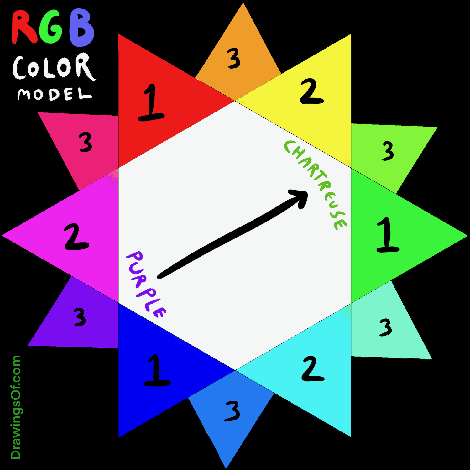
In the digital world, we use the RGB (Red, Green, Blue) model. Your phone screen works this way. In that system, the "opposite" of a violet-purple is actually a lime-greenish yellow. If you go by the CMYK model used in printing, things shift again. Honestly, though, for most artists, interior designers, and regular people just trying to pick out a tie, the opposite of purple is yellow.
Why does this happen? It comes down to "opponent process theory." This theory, first proposed by Ewald Hering in the late 19th century, suggests that our visual system treats certain colors as antagonists. You can’t see a "yellowish purple." It doesn't exist. Your brain literally won't allow it. They are mutually exclusive, which is why they create such a jarring, energetic vibration when placed side-by-side.
The Afterimage Effect
Try this. Find a solid purple square on your screen. Stare at it for thirty seconds without blinking. Then, look at a white wall. You’ll see yellow. This happens because your "purple-sensitive" cones in your retina get exhausted. When you look at white (which contains all colors), the tired cones take a break, leaving only the "yellow" signal to fire at full strength.
Psychological Warfare: What These Colors Do to Your Brain
Colors aren't neutral. They carry baggage. Purple has always been the color of the elite. Back in the day, the Phoenicians made "Tyrian purple" from the mucus of sea snails. It was gross. It was also incredibly expensive. Only emperors wore it.
Yellow? Yellow is the populist.
Yellow is the first color the human eye notices. It’s why school buses aren't purple. It’s why "Caution" tape isn't lavender. When you mix the opposite of purple with purple itself, you’re pairing the most "royal" color with the most "noticeable" color.
Contrast and Chaos
Designers use this "opposite" relationship to create what’s called simultaneous contrast. If you put a small purple circle on a yellow background, the purple looks darker, deeper, and more intense. If you put that same purple on a blue background, it looks dull. It loses its soul.
Marketing experts are obsessed with this. Think about Hallmark. Their logo is purple. Why? It feels "premium" and sentimental. But look at their stores or holiday sales—they often use yellow accents to grab your eye. They use the opposite of purple to make sure you don't just feel the "royalty" of the brand, but that you actually see the "sale" sign.
Natural Rivals: Where Biology Agrees
Nature is the ultimate graphic designer. Plants didn't just decide yellow and purple looked cool together; they evolved that way to survive. Many flowers use the opposite of purple to scream at bees.
Take the pansy or the iris. You'll often see a deep purple petal with a bright yellow center (the "honey guide"). To a bee, whose vision is shifted toward the ultraviolet spectrum, this contrast is like a neon "EAT HERE" sign. The bee sees the purple, follows the yellow, and pollinates the plant. It’s a biological partnership built on color theory.
Even in the autumn, you see it. The purple-stemmed pokeberry or certain asters stand out against the yellowing leaves of fall. It’s a final, high-contrast flare before winter sets in.
How to Use the Opposite of Purple in Your Life
If you’re decorating a room or picking an outfit, going full "opposite" can be risky. You don't want your living room to look like a sports bar unless you're a die-hard Minnesota Vikings fan.
The secret is "split-complementary" or "muted" pairings. Instead of using a bright, neon yellow against a deep grape purple, you might use:
- A soft, buttery cream (a tint of yellow) with a dark plum.
- An ochre or mustard with a dusty lavender.
- A metallic gold (yellow’s fancy cousin) with royal violet.
The Golden Rule of Proportions
When using the opposite of purple, don't go 50/50. It’s too much for the human eye to process. It creates "visual vibration," where the edges of the colors seem to blur or shake. It's literally painful to look at for long periods.
Instead, go for the 60-30-10 rule. 60% of a neutral color (like grey or white), 30% purple, and 10% yellow. That tiny 10% of yellow will do more work than the other 90% combined because it is the true chromatic antagonist of the purple.
Misconceptions About Color Opposites
People get this wrong all the time. They think the opposite of purple is orange. Or maybe green.
It’s understandable. In the "subtractive" color world—like when you’re mixing paint—blue and red make purple. Since yellow is the remaining primary color, it has to be the opposite.
But if you’re talking about light (the "additive" model), the opposite of purple (specifically violet) is actually a yellowish-green. This is why "night mode" on some older electronics would shift toward an amber/yellow tint to cancel out blue and violet light waves that keep you awake.
Actionable Steps for Using This Knowledge
Stop guessing. Start using the science of contrast to your advantage. Whether you're building a brand, painting a landscape, or just trying to make your garden look better, the relationship between these two colors is a tool.
- Check your brand's "Pop": If your logo uses purple, use a yellow "Call to Action" button on your website. It will get significantly more clicks than a red or blue one.
- Garden Design: Plant "Dutch Master" yellow daffodils alongside "Purple Sensation" alliums. They bloom around the same time and will make your neighbors stop their cars to look.
- Photography: If you’re shooting a subject in purple clothing, find a background with yellow tones—like a field of dry grass or a sunset. The subject will practically 3D-pop off the screen.
- Home Decor: Use yellow flowers in a purple vase. It sounds simple, but the visual "vibration" makes the room feel energized rather than sleepy.
Understanding the opposite of purple isn't just trivia. It’s about understanding how humans see the world. We are wired to notice the difference between the royal and the bright, the snail-dye and the sunshine.
When you want to be seen, you don't just use one color. You use its rival.
Next Steps: Identify one area in your home where the colors feel "muddy." Check if you're using colors that are too close to each other on the wheel. Introduce a small, deliberate splash of yellow—even just a book spine or a candle—to a purple-heavy area and watch how the entire space changes its energy.


