Yellow is the loudest color in the room. It’s the visual equivalent of a high-pitched whistle or a sudden burst of sunshine after three days of rain. Because it’s so high-energy, people often freeze up when trying to figure out what color matches with yellow. They default to white or black because it feels safe. But safety can be boring. Honestly, if you’re bold enough to wear a mustard sweater or paint a wall lemon chiffon, you shouldn't settle for boring.
Yellow is tricky. It has this weird psychological baggage. It's the color of optimism, sure, but it’s also the color of caution signs and radioactive waste warnings. This duality makes it intimidating. However, once you understand the science of the color wheel and how different shades of yellow—from pale butter to deep amber—react to their neighbors, the "clashing" fear goes away.
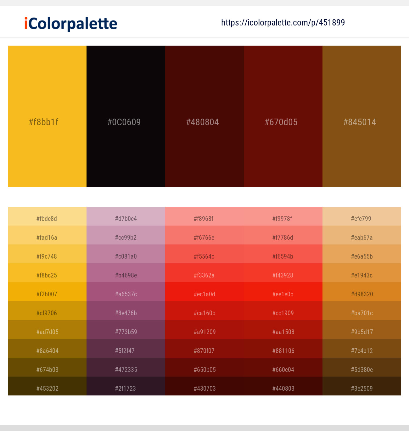
The Secret to Nailing What Color Matches With Yellow
Most people fail because they treat all yellows the same. They aren't. A neon yellow is a completely different beast compared to a muted ochre. If you try to pair a neon yellow with a soft lavender, it’s going to look like a bad Easter egg.
The first rule? Match the intensity.
If you’ve got a saturated, primary yellow, you need a color that can stand up to it. Navy blue is the heavyweight champion here. It’s the most classic answer to what color matches with yellow because they sit opposite each other on the color wheel—technically, purple is the direct complement, but blue-toned purples and deep navies provide that high-contrast "pop" that feels sophisticated rather than childish. Think of a nautical theme or a crisp blazer over a yellow sundress. It works because the dark blue grounds the vibration of the yellow.
Gray: The Modern Neutral You're Probably Underusing
Pantone actually highlighted this a few years back when they picked "Illuminating" (a bright yellow) and "Ultimate Gray" as their colors of the year. It wasn't just a random choice. Gray acts as a silencer. It takes the frantic energy of yellow and turns it into something architectural and sleek.
In interior design, a slate gray sofa with yellow throw pillows is a classic for a reason. The gray provides the structure, and the yellow provides the soul. If you use a light, dove gray, the yellow feels breezy. If you go with a dark charcoal, the yellow feels electric. It's about mood control.
Unexpected Combos: Pink and Yellow
This sounds like a recipe for a toddler’s birthday party, doesn't it? But wait.
When you look at high-end fashion or tropical-inspired decor, the combination of dusty rose and mustard yellow is incredibly high-fashion. It’s earthy. It’s warm. It works because both colors have a bit of brown or "dirt" in them. Avoid the bubblegum and the highlighter shades. Instead, go for a terracotta pink and a honey yellow. This is what interior designers call a "sunset palette." It feels organic. It feels like something you’d see in a Mediterranean villa at 6:00 PM.
Deep Green and the "Forest" Aesthetic
Green and yellow are neighbors. In color theory, we call this an analogous color scheme. Because they live next door to each other on the spectrum, the human eye finds their transition very soothing.
Think about a sunflower. The yellow petals and the deep green stalk. It’s nature’s own cheat sheet for what color matches with yellow.
- Forest Green: Pairs best with harvest yellows and golds. It feels expensive and heavy.
- Mint Green: Works beautifully with pale, buttery yellows for a vintage, 1950s kitchen vibe.
- Olive Green: This is the "cool kid" pairing. It’s slightly military, slightly bohemian. It’s a great way to wear yellow without looking like a banana.
Lavender: The High-Stakes Complement
If you want to get technical, purple is the true complement to yellow. Using them together is a bold move. It’s high contrast. It’s what the Los Angeles Lakers do, which is fine for a basketball jersey but maybe too much for your living room.
To make this work in a "human" way, you have to play with the shades. A soft lavender with a pale lemon is gorgeous for a spring wedding or a nursery. It’s airy. On the flip side, a deep royal purple with a goldenrod yellow feels regal, almost Victorian. But be careful. If the shades are too close in brightness, they will "vibrate" against each other, making it hard for people to look at them for too long.
The "No-Go" Zones (And How to Break the Rules)
Can you match yellow with red? Technically, yes. But you’re going to look like a hot dog stand or a certain famous fast-food clown. This is the "Ketchup and Mustard" effect.
The only way to pair red and yellow without looking like a value meal is to shift the tones. Instead of primary red, use a deep burgundy or maroon. Instead of bright yellow, use a metallic gold. Suddenly, you aren't at McDonald's; you’re at a high-end gala. It’s all about the "undertones."
Black and Yellow: The Warning Label
Nature uses black and yellow to tell you "Stay away, I might sting you." Bees, wasps, certain snakes—they all use this combo. Because of this, black and yellow is the most high-contrast pairing possible. It is the easiest to see from a distance, which is why taxi cabs and school buses use it.
If you’re wearing black and yellow, you are making a statement. You are saying, "Look at me." To tone it down, introduce a third color, like a crisp white or a light wash denim. This breaks up the "caution tape" vibe and makes the outfit feel more intentional and less like a costume.
Actionable Steps for Using Yellow Today
Don't just stare at a yellow swatch and panic. Start small and use these specific tactics to integrate the color into your life without the "Big Bird" risk.
- Follow the 60-30-10 Rule: If you’re decorating a room, use a neutral (like white or beige) for 60% of the space, a secondary color (like navy or teal) for 30%, and save the yellow for that final 10% splash. It makes the yellow feel like a curated choice rather than an accident.
- Check Your Skin Undertone: If you’re wearing yellow, look at your wrist. If your veins look blue, you have cool undertones—stick to lemon or "acid" yellows. If they look green, you’re warm—go for honey, mustard, and gold.
- Texture Matters: A yellow silk shirt looks very different from a yellow wool sweater. If you’re worried about the color being too "loud," choose a textured fabric. The shadows in the knit or the weave will naturally break up the brightness.
- The Denim "Safety Net": When in doubt, yellow matches with denim. Any shade. Any wash. Blue jeans are the universal solvent for "risky" colors. It’s impossible to mess this up.
- Look to History: If you're stuck, look at Wes Anderson films or mid-century modern graphic design. These creators are masters of using yellow in ways that feel nostalgic and balanced rather than overwhelming.
Yellow isn't a "difficult" color; it’s just a misunderstood one. By choosing a partner color that either grounds it (like navy or gray) or complements its natural warmth (like olive or terracotta), you can move past the safety of neutrals and actually have some fun with your palette. Stop playing it safe with beige. The world has enough beige.


