Yellow is tricky. It’s the color of sunshine and optimism, sure, but in the wrong light, a living room with yellow walls can feel less like a boutique hotel and more like the inside of a bruised banana or a 1970s dental office. People get scared of it. They default to "greige" because it’s safe, but honestly, yellow is having a massive comeback in 2026. The shift toward "dopamine decor" has pushed us away from sterile whites and toward colors that actually make us feel something when we walk through the front door.
But here is the thing: yellow isn't just one color. It’s a spectrum of light waves that react violently to your light bulbs and your windows.
If you’ve ever slapped a sample of "Lemon Zest" on your wall only to find it looks neon green by 4:00 PM, you know exactly what I’m talking about. Choosing the right shade for your living room requires a bit of science and a lot of honesty about how you actually use your space.
The Physics of Living Rooms with Yellow Walls
Light is everything. Seriously. Before you buy a single gallon of paint, you have to look at your windows. North-facing rooms receive a cool, bluish light that can make pale yellows look sickly or gray. If your living room faces north, you need a yellow with a warm, red, or orange undertone—think butterscotch or a rich ochre. This offsets the blue light and keeps the room from feeling chilly.
South-facing rooms are a different beast. They are bathed in warm, golden light for most of the day. This is the "easy mode" for living rooms with yellow walls. However, if you go too bright here, the sun will intensify the pigment until the room is literally blinding. For these spaces, designers like Abigail Ahern often suggest "muddy" yellows. These are shades that have been toned down with a bit of black or umber. They look sophisticated rather than childish.
Then there’s the LRV, or Light Reflectance Value. Every paint chip has one. It’s a scale from 0 to 100 that tells you how much light the color reflects. A yellow with an LRV of 80 will bounce light everywhere, making a small room feel huge. A deep mustard with an LRV of 30 will absorb light, creating a cozy, library-like vibe. Most people aim for the middle, but the middle is often where "boring" lives.
Why Buttercream is a Trap
We need to talk about buttercream. It’s the most common mistake in interior design. People want a "hint" of yellow, so they pick the lightest, creamiest swatch in the store. Once it's on all four walls, the "hint" multiplies. This is called "chromatic intensification." Because the walls reflect off each other, the color becomes much more intense than it looked on that tiny paper square.
If you want a soft, subtle look, you should actually look at whites with yellow undertones, or even "straw" colors that look almost beige on the swatch. Once they’re up, they’ll read as a beautiful, glowing yellow.
Real-World Palettes That Actually Work
Forget the primary color wheel for a second. To make yellow look high-end, you have to pair it with the right supporting cast. A living room with yellow walls doesn't have to look like a sunflower field.
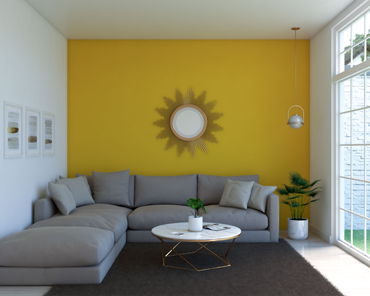
The Mustard and Charcoal Combo This is a classic for a reason. Deep, spicy mustard walls paired with a dark gray velvet sofa and matte black accents. It feels grounded. The gray acts as an anchor, preventing the yellow from feeling too floaty or whimsical. It’s moody. It’s modern. It works.
The Primrose and Sage Mix If you’re going for a more "English Countryside" aesthetic, soft primrose yellow walls against sage green trim or cabinetry is incredible. This palette relies on nature. Think about a meadow. You’ve got the yellow flowers, the green stems, and maybe some earthy brown wood furniture. It’s calming. It lowers your heart rate the moment you sit down.
Ochre and Navy Ochre is basically the grown-up version of yellow. It’s got depth. When you pair it with navy blue—its direct opposite on the color wheel—you get maximum contrast. This is a bold move. It’s high-energy. You’ll see this a lot in mid-century modern homes where the architecture can handle that kind of visual weight.
The Texture Factor
Yellow can look flat. If you’re painting a large living room, a flat matte finish in a bright yellow can sometimes look like plastic. This is where lime wash or "Roman Clay" finishes come in. Companies like Bauwerk or Portola Paints have popularized these finishes because they add "movement" to the wall.
When you use a lime wash, the yellow isn't just one solid block. It has variations—lighter and darker patches that mimic the look of aged plaster in an Italian villa. It’s tactile. It catches the light differently at various times of the day, which solves the problem of yellow feeling too "one-note."
Breaking the Rules: Beyond the Four Walls
You don't have to paint every wall. Honestly, sometimes you shouldn't.
The "fifth wall"—the ceiling—is a killer place for yellow. Imagine a living room with crisp white walls, dark wood floors, and a soft, glowing yellow ceiling. It mimics the feeling of a permanent sunrise. It draws the eye upward and makes the room feel taller.
Or, try the reverse. Paint the walls a deep, moody teal and paint the window frames and baseboards a sharp, glossy dandelion yellow. This is "unexpected red theory" but with yellow. It adds a pop of "look at me" energy without overwhelming the entire space. It’s a bit punk rock.
The Psychology of Living in a Yellow Room
Color psychology isn't just "woo-woo" nonsense; it's documented. Yellow stimulates the left side of the brain, which is responsible for logic and analytical thinking. It’s also known to increase metabolism (though hopefully you aren't eating your sofa).
However, too much of a high-intensity yellow can actually trigger anxiety or frustration. This is why you rarely see "Neon Canary" in a living room meant for relaxation. You want a shade that encourages conversation and warmth.
Expert interior designer Kelly Wearstler often talks about using "dirty" yellows—hues mixed with brown or gray—to create a sense of history and luxury. A bright, clean yellow feels new and sometimes cheap. A "dirty" yellow feels like it has a story. It feels like gold that’s lost its shine, which is somehow much more beautiful.
Common Pitfalls to Avoid
- Ignoring the Floor: If you have orange-toned oak floors, a bright yellow wall is going to make your house look like a giant basketball. You need contrast. If your floors are warm, go for a cooler, more "acidic" yellow or a very dark, earthy ochre.
- The "Too Many Accents" Problem: If your walls are yellow, your decor shouldn't be shouting for attention in every color of the rainbow. Pick two other colors and stop there.
- Lighting Temperature: If you have yellow walls and you use "Soft White" (2700K) light bulbs, your room will look orange. If you use "Daylight" (5000K) bulbs, it might look green. Aim for "Bright White" (3000K to 3500K) to keep the yellow looking true to the swatch.
- Testing in Isolation: Never judge a paint color by a small swatch held up to a white wall. The white wall will make the yellow look darker than it actually is. Paint a large piece of poster board and move it around the room throughout the day.
How to Scale Your Yellow
If you are nervous, start small. You can't just jump into a full-blown sunflower living room if you’ve lived in a beige box for ten years.
Start with the back of a bookshelf. Paint the interior a vibrant saffron. It’s a tiny commitment, but it changes how your books and objects look. From there, maybe move to an accent wall behind the TV or the fireplace.
The most successful living rooms with yellow walls are the ones where the owner didn't apologize for the color. They leaned in. They added the velvet curtains, the brass lamps, and the weird art. Yellow is a confident color. It requires a confident hand.
Actionable Next Steps for Your Space
- Identify your light source: Determine if your living room is North, South, East, or West facing. This dictates your undertone.
- Order large-scale peel-and-stick samples: Don't mess with tiny chips. Brands like Samplize allow you to see the color across a 12x12 inch area without ruining your current paint.
- Check your existing furniture: Take a photo of your sofa and floor. Hold the yellow sample against the photo. If they "vibrate" (look painful to the eye), the undertone is wrong.
- Consider the finish: Decide between a standard matte/satin or a decorative finish like lime wash to add depth.
- Audit your lighting: Swap out your bulbs to a neutral 3000K range before the paint goes on the wall to ensure you're seeing the "true" color.
Yellow is a risk, but it’s a high-reward one. When you get it right, the room doesn't just look better; it feels warmer. It feels like a place where things happen. It’s a bold choice that says you aren't afraid of a little personality in a world that is increasingly obsessed with looking like a minimalist hotel lobby.


