You’ve seen it a thousand times. That explosion of neon yellow, the weirdly proportioned cartoon faces, and the sense that if you stared at it too long under the right—or wrong—lighting, the characters might actually start blinking at you. The yellow submarine album cover is arguably one of the most recognizable pieces of pop art in history, but there is a massive misconception about who actually sat down and drew it.
Most people look at that cover and think, "Oh, Peter Max did that." Honestly? He didn't.
While the aesthetic screams Max’s specific brand of 1960s cosmic pop, the actual credit belongs elsewhere. The visual soul of the Yellow Submarine project was a Czech-born illustrator named Heinz Edelmann. It’s a bit of a tragic irony in the art world. Edelmann basically invented a visual language that defined an entire era of "trippy" design, yet his name often gets swallowed up by the more commercially successful American artists of the same period.
The Man Behind the Submarine
Heinz Edelmann wasn't even a fan of the Beatles' music when he started.
He was a graphic designer and illustrator who had been doing sophisticated, somewhat darker work in Germany. When he was brought on as the art director for the Yellow Submarine film, he had a massive problem. He had to create a feature-length animation on a shoestring budget with a timeline that was basically impossible. Most of the "hallucinogenic" style wasn't just a creative choice; it was a functional one.
Edelmann realized that if they used flat, bold colors and thick outlines, they could hide the fact that they didn't have the time or money for Disney-level fluid animation. He was a genius of efficiency. The yellow submarine album cover we see today is a direct distillation of that "necessity is the mother of invention" spirit. He wanted to move away from the "Pepper-land" vibe and into something more "2D and decorative."
It’s actually kinda funny when you think about it. The most iconic "drug" movie and album cover of the sixties was designed by a guy who claimed he never took any drugs. Edelmann often said his only "trip" was his own imagination. He was inspired by Victorian postcards, Art Nouveau, and the works of Aubrey Beardsley. He wasn't trying to draw a "stoner" world; he was trying to draw a world that looked like a dream where the physics didn't quite work.
Why the Cover Art and the Film Are Inseparable
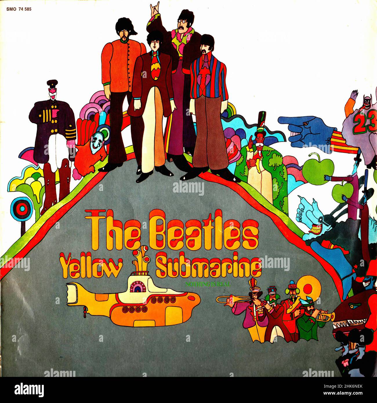
The cover itself is a collage-style representation of the film's climax.
You have the "Fab Four" in their Sgt. Pepper uniforms, looking notably more colorful and caricatured than they ever did in real life. If you look closely at the yellow submarine album cover, you’ll notice the Beatles don't look like the Beatles from A Hard Day’s Night. They are stylized icons. John has those elongated, inquisitive eyes. Paul has the wide, innocent stare. George looks like a mystical sage. Ringo looks... well, like a very confused cartoon character.
Behind them, the submarine itself sits at an angle that defies perspective. It’s not "in" the water. It’s "on" the page.
The background is a frantic mess of psychedelic flora and fauna. These weren't just random doodles. These were the residents of Pepperland. Edelmann’s team at TVC London, including people like Millicent McMillan and others who worked on the backgrounds, spent months hand-painting these cells. When it came time to create the album jacket for the January 1969 release, they basically took the most striking assets from the movie and rearranged them.
The Back Cover Mystery
Interestingly, if you own an original 1969 UK pressing, the back of the yellow submarine album cover is actually more text-heavy and "boring" than the front. It features a long, somewhat rambling review of the White Album by Tony Palmer. It’s a weird marketing move. You’d think they would want to talk about the new movie, but instead, they used the back of the jacket to defend the Beatles' previous experimental record.
The US version, released by Capitol Records, was different. It featured a short "fictional" biography of the Beatles' journey through Pepperland. This is where a lot of the lore about the Blue Meanies and the Dreadful Flying Glove really took root in the American consciousness.
The Hidden Symbols (That Might Not Actually Be Symbols)
Beatles fans are notorious for over-analyzing everything.
You’ve got the "Paul is Dead" theorists who looked at the Abbey Road cover and saw a funeral procession. Naturally, they did the same with the yellow submarine album cover. Some people pointed to the fact that John Lennon’s hand is held over Paul McCartney’s head in a way that looks like a priest’s blessing or a sign of death.
Honestly? It was just a drawing.
Edelmann was asked about this years later. He basically laughed it off. He was just trying to fill space in a way that looked balanced. There are no hidden messages about the band breaking up. There are no secret clues about Yoko Ono. It was a commercial product designed to sell a movie and a soundtrack that—let's be real—only had four "new" Beatles songs on it anyway.
The real "secret" is how much of the artwork was influenced by the constraints of the 1960s printing process. Those bright oranges and piercing blues were chosen because they popped on cheap cardboard. If they had gone with more subtle, muted tones, the album would have looked muddy on the shelves of a record store in 1969.
Why This Art Style Still Dominates Today
We see the DNA of the yellow submarine album cover everywhere.
- Modern Animation: Shows like Adventure Time or The Midnight Gospel owe a direct debt to Heinz Edelmann. That "rubber hose" limb style mixed with surrealist backgrounds? That started here.
- Flat Design: The tech world’s obsession with "flat design" in the 2010s was basically a corporate, sanitized version of what the Yellow Submarine team was doing.
- Poster Art: Go to any concert today and look at the silk-screened posters. The high-contrast color palettes are a direct echo of the 1968 aesthetic.
The Beatles themselves were famously "meh" about the project at first. They hated their previous cartoon series and thought this movie would be more of the same. They only agreed to do it to fulfill a three-picture deal with United Artists. But once they saw the work Edelmann was doing, they changed their tune. They realized this wasn't a "kiddie" cartoon. It was a piece of avant-garde cinema that happened to have catchy songs.
The Difference Between the 1969 and 1999 Versions
If you are a collector, you know that the yellow submarine album cover you buy today is slightly different from the one your parents might have bought.
In 1999, Apple Corps released the Yellow Submarine Songtrack. They changed the cover. Instead of the busy, collage-style art of the original, the 1999 version is much cleaner. It focuses on the submarine itself and the four Beatles walking toward the viewer.
Purists usually hate it.
The original 1969 cover feels like a snapshot of a chaotic world. The 1999 version feels like a logo. While the 1999 release actually has better sound (and includes more songs from the movie), the original cover art is the one that people frame and put on their walls. It’s about the vibe, not the tracklist.
Actionable Insights for Collectors and Fans
If you're looking to dive deeper into the history or even start a collection, keep these points in mind:
- Check the Artist Credits: If you find a book or print claiming Peter Max did the Yellow Submarine art, you’re looking at a piece of common misinformation. Look for Heinz Edelmann’s name.
- Inspect the "Flipback" Sleeves: On original UK versions of the yellow submarine album cover, the cardboard of the front cover folds over onto the back. These are the "true" first pressings and are worth significantly more.
- The Mono vs. Stereo Debate: The original 1969 mono version is actually quite rare because, by that point, the world was moving to stereo. If you find a mono copy with the original cover art in a bargain bin, grab it. It’s a unicorn.
- Look at the "Nothing is Real" Line: Use the artwork as a gateway to the film. The movie was recently restored in 4K, and seeing the art move after staring at the still image on the cover is a completely different experience.
The yellow submarine album cover wasn't just a marketing tool. It was a pivot point. It proved that rock music could be visual, that animation could be for adults, and that a bright yellow boat could become a global symbol for peace and "dropping out." It’s messy, it’s loud, and it’s perfectly imperfect. Just like the sixties.