Honestly, yellow is a scary color for a lot of people. It’s loud. It’s aggressive if you pick the wrong shade. It can make a room look like a bowl of curdled custard or, even worse, a dated 1970s kitchen that smells like stale cigarettes. But something shifted recently. Maybe we’re all just tired of the "sad beige" era or the clinical feeling of all-white minimalism, but yellow living room ideas are blowing up on Pinterest and in high-end design portfolios right now. People are realizing that yellow isn’t just "bright"—it’s actually a neutral if you know what you’re doing.
Designers like Abigail Ahern have been preaching the gospel of moody, ochre-toned yellows for years. It’s about warmth. It’s about making a space feel like it’s being kissed by a permanent sunset even when it’s raining outside in the middle of January.
The psychology of why yellow living room ideas actually work
Color theory isn't just some buzzword interior designers use to justify an expensive consultation fee. It's real science. Yellow is the first color the human eye notices. It’s why school buses and taxi cabs are that specific shade. In a living room, that translates to an immediate hit of dopamine.
According to the Pantone Color Institute, yellow represents optimism. But there’s a catch. Too much high-saturation yellow can actually increase anxiety or make people feel frustrated. You’ve probably been in a room that felt "too yellow"—that jarring, neon-adjacent glow that makes you want to squint. The trick to a successful living room isn't necessarily going full "Big Bird." It’s about the undertones. A yellow with a green undertone feels fresh and citrusy. A yellow with a red or brown undertone feels earthy and grounded.
Most people get it wrong because they pick a paint chip under the fluorescent lights of a hardware store. Big mistake. You have to see how the light hits that pigment at 4:00 PM when the sun is low.
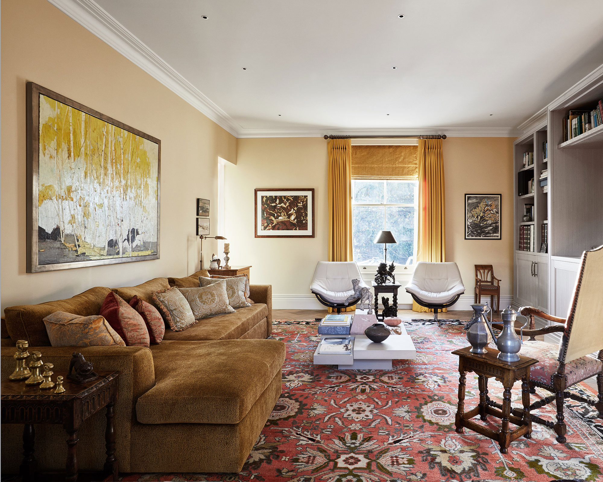
The "Ochre" Movement vs. Pastel Yellows
We’re seeing a massive divide in how yellow is being used in 2026. On one hand, you have the "Grandmillennial" crowd. They love those soft, buttery primrose yellows. It’s very English countryside. It’s soft. Think Farrow & Ball’s Hay or Daylyght. These shades work beautifully with floral prints and antique wood furniture.
On the flip side, there’s the mid-century modern obsession with mustard and ochre. This is where yellow gets "cool." When you pair a deep, spicy mustard with charcoal grey or a navy blue, the room suddenly feels sophisticated rather than childish. It’s the difference between a nursery and a lounge where you’d actually want to drink an Old Fashioned.
How to use yellow without losing your mind
If you’re terrified of painting all four walls, don't. Start small. A "pop of color" is a cliché, sure, but it’s a cliché for a reason.
One of the most effective yellow living room ideas is the "fifth wall" technique. Paint your ceiling a soft, pale yellow. It mimics the glow of a skylight. Keep the walls a crisp, warm white. Suddenly, the whole room feels taller. It’s a weird psychological trick that works every time.
Then there's the furniture. A velvet yellow sofa is a massive commitment. It’s the protagonist of the room. If you go that route, everything else needs to be a supporting character. Ground that bright sofa with a heavy, textured jute rug or dark walnut coffee table. You need that visual weight so the sofa doesn't look like it’s floating in space.
Lighting is the make-or-break factor
You can spend $200 a gallon on the most beautiful Italian lime wash paint, but if you have "cool white" LED bulbs in your ceiling fan, your yellow living room will look like a hospital hallway.
Yellow needs warm light. You want bulbs in the 2700K to 3000K range. Anything higher and the yellow turns sickly. Use lamps. Layer your lighting. A floor lamp with a linen shade will diffuse the light and make those yellow tones feel rich and inviting. If you have a north-facing room with weak, blue-tinted natural light, yellow is your best friend. It compensates for the lack of sun better than any other color on the wheel.
Real-world examples of yellow done right
Look at the work of designer Beata Heuman. She’s a master of using "off" yellows—shades that almost look like tea-stained parchment. In one of her famous projects, she used a high-gloss yellow on the woodwork and trim while keeping the walls a muted cream. It’s unexpected. It’s bold. It turns the architecture of the room into the art itself.
Another great example is the use of yellow in small, dark apartments. Traditionally, the advice was "paint it white to make it look bigger." That’s actually terrible advice for rooms with no natural light; white just looks grey and dingy in the shadows. But a saturated, earthy yellow? It thrives in the dark. It embraces the coziness. It turns a "small room" into a "snug."
- Try Mustard Accents: If you have a grey sofa, throw on some ochre linen pillows. It’s the easiest gateway drug to yellow.
- The Power of Gold: Brass fixtures count as yellow. Swapping out your cabinet pulls or lamp bases for brushed brass adds that yellow warmth without a single drop of paint.
- Window Treatments: Yellow curtains can act like a filter for the sun. Even on a cloudy day, the light coming through the fabric will make the room feel like it's glowing.
Misconceptions about the "Yellow Curse"
People think yellow makes you angry. There’s this old wives' tale that babies cry more in yellow rooms. While there’s some debated research from the 1970s about overstimulation, it really comes back to saturation.
Neon yellow? Yeah, that’s going to be annoying after ten minutes. But a "dead salmon" or a "yellow-pink" hybrid is incredibly soothing. The misconception is that yellow has to be loud. It doesn't. It can be a whisper.
You also don't have to match your yellows. In fact, please don't. A room where the rug, the walls, and the pillows are the exact same shade of lemon looks like a stage set. Mix your yellows. Put a bright canary yellow vase next to a muddy mustard book cover. That layering creates depth. It makes the room look like it evolved over time rather than being bought in a single afternoon from a showroom floor.
Contrast is your best friend
Yellow needs a foil. Without contrast, it’s just a blur.
- Navy Blue: This is the classic, high-contrast pairing. It’s regal. It’s safe.
- Forest Green: Very "organic modern." It feels like a garden.
- Lavender: This is for the brave. Yellow and purple are opposites on the color wheel. A pale lavender wall with a bold yellow chair is high-fashion interior design.
- Grey: Be careful here. The "Pantone Colors of the Year" 2021 (Illuminating and Ultimate Gray) tried to make this happen, but it can easily look like a corporate office if you aren't careful. Use a very dark charcoal grey to make the yellow sing.
Actionable steps for your yellow transformation
Stop looking at tiny paint chips. They are lying to you.
Go to the store and buy a sample pot. Paint a large piece of poster board—at least two feet by two feet. Move that board around the room throughout the day. Look at it in the morning light. Look at it at night with your lamps on. You’ll be shocked at how a color that looked like "sunshine" at 10:00 AM looks like "neon mustard" at 8:00 PM.
If you’re still nervous, start with the "Rule of Three." Introduce three yellow items into your living room. Maybe a throw blanket, a piece of art with yellow tones, and a single yellow book on the coffee table. See how you feel living with the color for a week. If you find yourself gravitating toward those spots, you’re ready for the paint.
Don't forget the power of texture. A flat yellow wall is one thing, but a yellow limewash or a textured wallpaper adds a level of sophistication that flat latex paint just can't match. The way the light catches the "peaks and valleys" of a textured surface breaks up the color and prevents it from feeling overwhelming.
Yellow is a commitment to a mood. It’s a choice to be cheerful, even when the world outside feels a bit grey. Whether you go for a bold, mid-century mustard or a soft, Victorian butter, you’re essentially "lighting" your room from the inside out.
Next Steps for Success:
- Identify your light source: North-facing rooms need warmer, more saturated yellows; South-facing rooms can handle paler, cooler tones.
- Test your samples: Always paint at least a 24-inch square and observe it for 48 hours.
- Balance with neutrals: Use wood tones, black accents, or natural fibers like jute to ground the brightness.
- Consider the "Fifth Wall": If the walls feel like too much, look up and consider a pale yellow ceiling.


