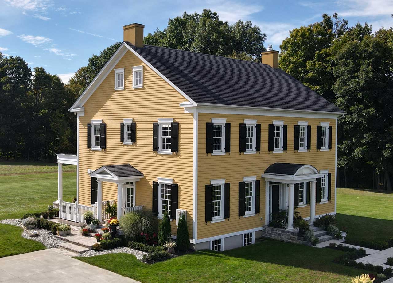
Walk down any historic street in Charleston or a leafy suburb in Connecticut, and you’ll see it. That cheerful, sunny facade anchored by something surprisingly muted. It’s a yellow house with gray shutters. It sounds simple, right? But honestly, if you get the undertones wrong, your house ends up looking like a bruised lemon or a piece of construction equipment. Get it right, though, and you’ve got a property that feels both historic and weirdly modern at the same time.
Most people panic when they pick yellow. They worry it’s too "loud." Then they panic about gray because they think it’s too "boring."
The magic happens in the contrast. Yellow is high-energy. It’s a "look at me" color. Gray is the diplomat. It calms the yellow down, stops it from screaming at the neighbors, and gives the architecture some much-needed weight. It’s a classic pairing for a reason, but there are some massive pitfalls that most homeowners fall into because they’re looking at a two-inch paint swatch in the fluorescent lighting of a Home Depot instead of looking at how the sun actually hits their siding at 4:00 PM.
Why a yellow house with gray shutters is a design cheat code
Yellow is a tricky beast. It is one of the most reflective colors on the visible spectrum. When you put it on a large surface like a house, it intensifies. A color that looks like a soft "butter cream" on a tiny card can easily look like "neon highlighter" once it covers 2,000 square feet of clapboard.
That’s where the gray shutters come in.
They provide a visual "stop." Without them, a yellow house can feel like a big, undifferentiated blob of color. The gray creates a frame. It draws the eye to the windows, which are the "eyes" of the home. Designers like Bunny Williams have long championed this kind of traditional palette because it feels grounded. It doesn’t try too hard.
There’s also the psychological factor. We associate yellow with optimism and gray with stability. It’s basically the "Ultimate Gray" and "Illuminating" Pantone Colors of the Year from 2021, but applied to architecture. It works because it balances warmth and coolness. If you used black shutters, the contrast might be too harsh—think bumblebee. If you used white, it might look a bit too "shabby chic" or washed out. Gray is that perfect middle ground.
The undertone trap: Don't mess this up
You can't just pick "Yellow" and "Gray." You have to look at the "temperature" of the paint. This is where most DIY projects go off the rails.
Yellows generally fall into two camps:
- Warm Yellows: These have red or orange undertones. Think gold, mustard, or saffron.
- Cool Yellows: These have green or lemon undertones. They feel crisp, almost acidic.
If you have a warm yellow house, you need a gray shutter that has a bit of warmth in it—maybe a "greige" or a charcoal with a hint of brown. If you pair a warm yellow house with a cool, blue-toned gray, the colors will fight each other. It’ll look "off," and you won't quite be able to put your finger on why. It’s because the undertones are vibrating against one another.
Take a look at Benjamin Moore’s Hawthorne Yellow. It’s a classic historical color. It’s a bit muted, not too bright. If you pair that with something like Amherst Gray, which has a slight green/brown undertone, the whole house feels cohesive. It looks like it’s been there for a hundred years.
Conversely, if you’re going for a pale, buttery yellow like Sherwin-Williams’ Westhighland White (which is basically a yellow-white), you can get away with a much cooler, slate gray. The blue in the slate pops against the creaminess of the siding.
Real-world examples of the "Yellow and Gray" effect
I remember seeing a farmhouse in upstate New York that absolutely nailed this. The siding was a deep, moody mustard. Not bright, but saturated. The shutters weren't just "gray"—they were a dark, stormy charcoal that almost looked black in the shade but turned a soft, velvety flint in the direct sun.
The owner told me they had tried four different grays before they realized the first three were too "pure." They needed a gray with a "muddy" quality to match the earthy tone of the mustard.
Then you have the coastal look.
In places like Cape May, you’ll see pale primrose yellow houses with light silver-gray shutters. It feels airy. It feels like the beach. Here, the goal isn't drama; it's light. By keeping the gray light, you don't break up the silhouette of the house as much. It stays soft.
Let's talk about the "Three-Color Rule"
Your yellow house with gray shutters isn't just two colors. You have a third player: the trim.
Usually, this is white or off-white. But the shade of white matters just as much as the yellow. If you use a stark, "brilliant white" trim with a warm yellow and a warm gray, the trim is going to look like a neon sign. It’ll be too sharp. You usually want an "off-white" or "cream" trim to bridge the gap between the sunniness of the yellow and the sobriety of the gray.
Some daring people skip the white trim altogether.
They do yellow siding, gray shutters, and then a darker gray or even a dark cream for the trim. This is a much more sophisticated, "European" look. It’s less "Colonial America" and more "French Countryside." It makes the house look smaller and more "tucked in."
Maintenance and the "Fade" factor
Here’s a bit of practical reality: yellow fades.
It’s just physics. Yellow pigments, especially the brighter ones, are susceptible to UV degradation. Gray, depending on the base, usually holds up a bit better. This means that five years down the line, your yellow house might look a little more "pale straw" than "bright lemon."
When choosing your shutters, keep this in mind. A very dark gray shutter will maintain its "pop" even as the yellow siding softens over time. If you go too light with the gray initially, the whole house might look monochromatic and washed out after a few years of heavy sun exposure.
Misconceptions about this color palette
People often think yellow houses are only for "cute" cottages.
That’s just wrong. A massive Victorian or a sprawling Federal-style home can look incredible in yellow. The key is the saturation. For a large house, you generally want to move away from "yellow" and toward "ochre" or "gold." The larger the surface area, the more "grayed out" your yellow should be.
Another myth? That gray shutters make a house look depressing.
Hardly. Gray is actually the color that allows the yellow to shine. Think of it like a frame for a painting. The frame shouldn’t compete with the art; it should support it. A gray shutter provides the shadow and the structure that a bright color like yellow desperately needs to feel like a "home" and not a "playhouse."
Step-by-step to picking your specific shades
- Identify your "Fixed" elements. Do you have a red brick chimney? A gray stone foundation? A brown roof? Your gray shutters must coordinate with the roof. If you have a warm brown roof, your gray shutters should be warm (brownish-gray). If you have a black or gray roof, go with a cooler slate gray.
- Test at three different times of day. Put a sample of your yellow and your gray on the north side and the south side of your house. Look at it at 8:00 AM, Noon, and 6:00 PM. Yellow will change more than almost any other color.
- Consider the "LRV" (Light Reflectance Value). Most paint fan decks list the LRV. For a yellow house, look for an LRV between 45 and 70. Anything higher will be blinding in the sun. For the gray shutters, look for an LRV under 20 to provide enough contrast.
- Don't forget the door. This is your "accent" moment. With a yellow house and gray shutters, you can do a classic navy blue door, a deep forest green, or even a bold "heritage red." Or, keep it sleek and paint the door the same gray as the shutters for a more modern, streamlined look.
The verdict on the yellow and gray look
It’s a timeless choice, but it requires a bit of an "editor’s eye." You aren't just painting a house; you’re managing light and shadow. The yellow brings the "light," and the gray shutters bring the "shadow."
If you’re feeling stuck, look at historical palettes from brands like Farrow & Ball or the Sherwin-Williams Historic Collection. These colors are pre-vetted to work together. A color like Yellowstone paired with Down Pipe is a foolproof way to get that high-end, designer look without having to guess.
Actionable insights for your exterior project
- Check your neighborhood's HOA rules before you buy ten gallons of paint; yellow is often a restricted color because of how much it stands out.
- Order large "peel and stick" samples (like Samplize) instead of painting small patches on your siding; it's much cleaner and allows you to move the color around the house.
- Evaluate your landscaping. Yellow houses look incredible against deep green evergreens and purple flowers (like lavender or salvia), which are yellow's "complementary" colors on the color wheel.
- Match your hardware. If you’re going with gray shutters, consider black or oil-rubbed bronze hardware for the shutters and the front door to keep the "grounded" feel.
- Keep the sheen low. Use a "flat" or "eggshell" finish for the yellow siding. A "semi-gloss" is okay for the shutters to make them pop, but a "satin" finish is usually the most modern and forgiving for exterior wood.


