Gray is over. Or so the "design influencers" on TikTok want you to believe. They’ve spent the last three years calling it "millennial gray" and acting like a neutral palette is some kind of moral failing. But honestly? They’re wrong. Gray isn't dead; it’s just lonely. It needs a partner to give it a pulse, and nothing does that better than yellow. Yellow gray living room decor is one of those combinations that sounds like a 2011 throwback, but when you actually see it done right in a modern home, it’s vibrant. It’s sophisticated. It's basically a shot of espresso for a tired room.
The trick is balance. If you overdo the yellow, you’re living in a lemon. If you lean too hard into the gray, you’re sitting in a concrete bunker. Finding that sweet spot where a charcoal sofa meets a mustard throw is where the magic happens.
The Psychology of the Palette
Why does this work? Science. Sort of. Color theory tells us that yellow is the color of optimism and energy. It triggers a dopamine release. Gray, on the other hand, is the ultimate stabilizer. It’s the visual equivalent of a deep breath. When you combine them, you’re creating a space that feels both energized and grounded.
In 2021, Pantone actually named "Ultimate Gray" and "Illuminating" (a bright yellow) as their Colors of the Year. It was a response to the global chaos of the time—people needed the strength of a rock and the hope of a sunny day. Even though we’ve moved past 2021, the logic holds up. You want your living room to be a place where you can actually relax, but you don't want it to feel like a doctor’s waiting room.
Choosing the Right Shades (Don't Mess This Up)
Not all yellows are created equal. If you pick a neon yellow and pair it with a blue-toned cool gray, your living room is going to look like a high-visibility safety vest. Nobody wants that.
Instead, look for depth.
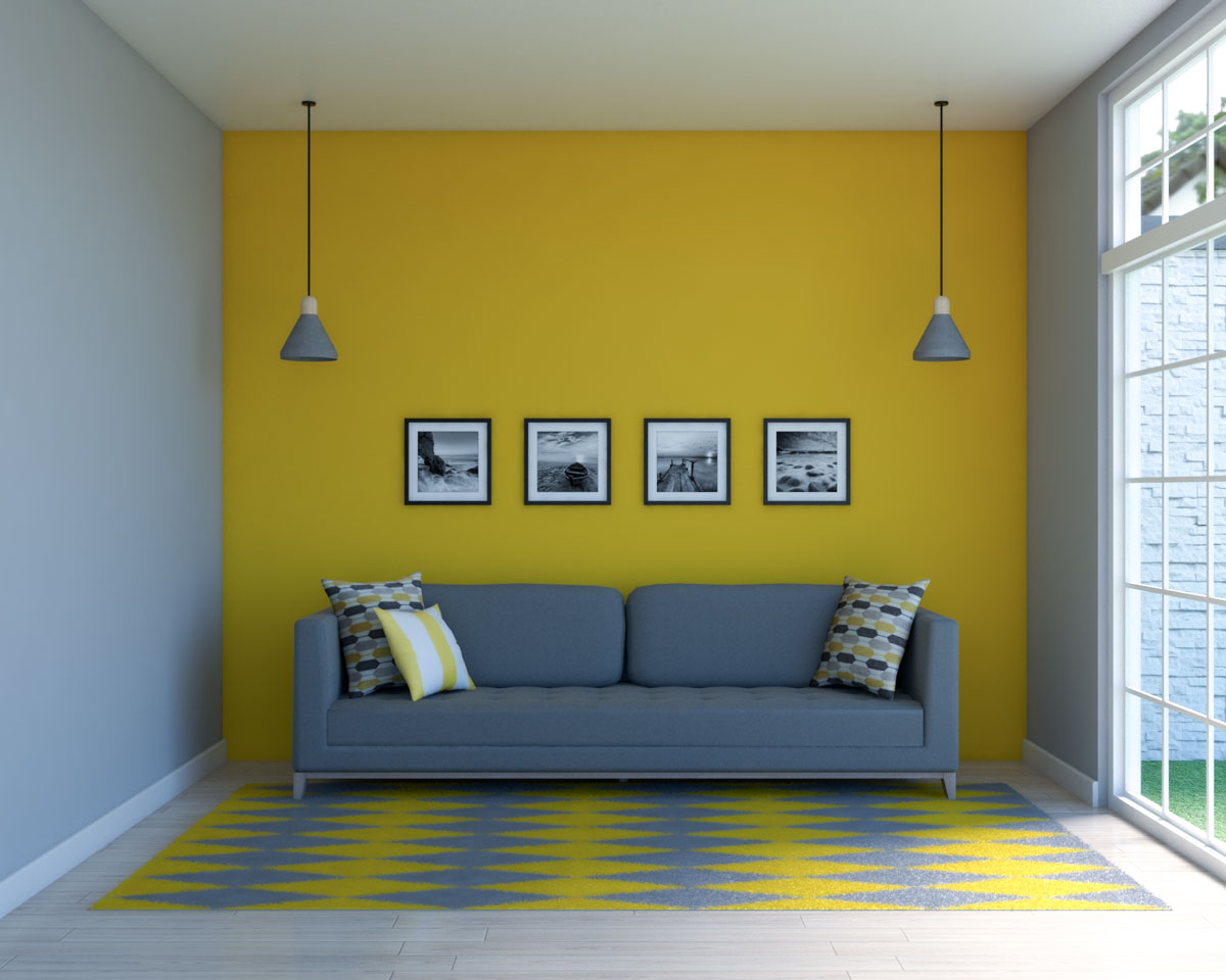
Mustard and Charcoal: This is the gold standard. A deep, moody charcoal provides a heavy base that allows a rich mustard yellow to pop without feeling childish. It’s sophisticated.
Amber and Slate: Amber has more orange undertones. It feels "expensive." When you put it against a mid-tone slate gray, it creates a mid-century modern vibe that feels very curated and intentional.
Lemon and Dove Gray: This is for the "light and airy" crowd. It’s risky because it can look washed out if you don't have enough natural light. But in a sun-drenched room? It’s stunning.
Real World Implementation: Beyond the Throw Pillow
Most people approach yellow gray living room decor by buying a gray couch and tossing two yellow pillows on it. It’s fine. It’s safe. But it’s also a little boring. If you want a room that actually looks like an interior designer stepped foot in it, you have to think about layers and textures.
Think about your walls. A "greige" (gray-beige) wall provides a warmer backdrop than a stark, cold gray. According to design experts at Sherwin-Williams, shades like Agreeable Gray have become industry standards for a reason—they adapt to the light. On a wall like that, a piece of oversized art with splashes of cadmium yellow becomes a focal point rather than an afterthought.
Texture is your best friend here.
A velvet yellow armchair against a matte gray wall creates a contrast in sheen that feels luxurious. Or try a gray wool rug with a subtle yellow geometric pattern. It’s about integration. You want the colors to feel like they’re having a conversation, not like they’re shouting at each other from opposite sides of the room.
The Lighting Factor
Lighting changes everything. Yellow is notorious for shifting under different light temperatures. Under warm, incandescent bulbs (the yellow-ish ones), your yellow decor might start to look muddy or overly orange. Under cool LEDs, it can look green.
I always suggest 3000K bulbs. They sit right in that "neutral white" sweet spot. This allows the gray to stay crisp and the yellow to stay true to its pigment. If you have a dark corner, don't just put a lamp there. Put a lamp with a yellow ceramic base. It acts as a "faux sun" even when the light is off.
Mistakes People Make (The "Banana" Effect)
The biggest mistake? Saturated yellow on large surfaces.
Unless you are a professional maximalist with a very specific vision, do not paint your entire living room bright yellow. It’s aggressive. It will give you a headache by noon. The gray should almost always be your "anchor" color—the one that occupies about 60% to 70% of the visual space. Yellow should be the "accent," taking up maybe 10% to 20%. The rest should be white, wood tones, or black to break it up.
Another trap is the "matchy-matchy" look. You don't need the yellow in your rug to perfectly match the yellow in your curtains. In fact, it shouldn't. Using different shades of the same color—like a pale primrose yellow mixed with a deep ochre—adds "dimension." It makes the room look like it evolved over time rather than being bought as a set from a big-box furniture store.
Furniture Choice and Placement
Let’s talk about the "big" pieces. If you’re shopping for a sofa, go gray. Every time. A yellow sofa is a massive commitment. It’s a statement piece that dictates every other choice in the room. A gray sofa is a chameleon. You can change your entire aesthetic in five years just by swapping out the accessories.
If you really want yellow furniture, go for the "supporting cast."
- An ottoman or pouf.
- A side chair.
- A painted bookshelf.
- Picture frames.
Wood tones also play a huge role in how yellow gray living room decor feels. Darker woods like walnut make the combo feel more traditional and masculine. Lighter woods like oak or birch lean into that Scandi-cool look that everyone is obsessed with right now.
Why Texture Matters More Than Color
A flat gray room is depressing. A flat yellow room is annoying. To make them work, you need "tactile interest." Imagine a gray linen sofa. Now put a chunky, cable-knit yellow throw over the arm. Suddenly, the room feels cozy.
Natural elements are the "secret sauce." Bring in some greenery. The green of a Monstera or a Fiddle Leaf Fig acts as a bridge between the gray and the yellow. It’s a natural trio. You’ve got the earth (gray), the sun (yellow), and the life (green). It sounds cheesy, but it’s the blueprint for a balanced space.
The Longevity of Yellow and Gray
Is this a trend that’s going to look dated in two years? Honestly, probably not if you do it subtly. The "Chevron" era of 2012 gave yellow and gray a bad name because it was so repetitive and loud. But the 2026 version of this palette is much more muted.
We’re seeing a move toward "earthy" grays—colors that look like stone or wet clay—paired with "harvest" yellows like honey and turmeric. These are timeless colors. They feel organic. They don’t feel like they came out of a plastic factory.
Actionable Steps to Refresh Your Space
If you’re sitting in a boring room and want to pivot to this palette, don't go out and buy a new living room set today. Start small and build the layers.
Step 1: Audit your grays. Look at your existing gray items. Are they "warm" (red/brown undertones) or "cool" (blue/purple undertones)? This determines which yellow you should buy. Warm grays love ochre and mustard. Cool grays love lemon and citron.
Step 2: The "Rule of Three." Introduce yellow in at least three places at different heights. Maybe a vase on a shelf, a pillow on the couch, and a pattern in the rug. This pulls the eye around the room and makes the color choice feel intentional.
Step 3: Neutralize the "Middle." Ensure you have enough white or cream to act as a buffer. If the gray and yellow are touching everywhere, the room will feel "busy." Use white trim, white lampshades, or cream curtains to give the eyes a place to rest.
Step 4: Check your metals. Gold and brass hardware look incredible with this palette. They basically act as a "metallic yellow." Silver or chrome can make the room feel a bit cold, so if you use them, make sure your yellow is extra warm to compensate.
Step 5: Test under night light. Buy one yellow item—even just a cheap towel or piece of fabric—and leave it in the room for 24 hours. See how it looks at 8:00 PM when the sun is down. If it looks like a "bruise," it's the wrong shade of yellow.
By focusing on these nuances—tonal variation, lighting temperature, and the 60-30-10 distribution rule—you can create a living room that feels designer-level without the designer price tag. Yellow and gray isn't just a color combination; it's a mood. It’s about making your home feel like a place where things actually happen, rather than just a gray box you sleep in.


