Yellow is a bully. Honestly, there is no other way to describe a color that can literally change your heart rate or make you feel like you’re trapped inside a giant lemon. Most people approach a yellow colour living room with this idealized, Pinterest-fueled dream of eternal sunshine. They buy a bucket of "Dandelion" or "Sunbeam," slap it on four walls, and then wonder why they have a headache by 4:00 PM. It’s too much. It’s aggressive.
But when it’s right? It is magic. For another view, check out: this related article.
The problem isn't the color itself. The problem is that yellow is the most light-sensitive pigment in the interior design world. According to the Pantone Color Institute, yellow is associated with happiness and optimism, but in architectural applications, it’s also the color most likely to cause visual fatigue if the saturation isn't perfectly balanced with the room's orientation. You’ve probably seen those rooms that look amazing in a magazine but feel like a high-voltage electrical fence in real life. That’s a failure of nuance.
The science of why your yellow colour living room feels "off"
Let’s talk about the physics for a second. Light hitting a wall isn't just "light." In a north-facing room, that light is bluish and cool. If you put a pale, lemony yellow in a north-facing space, the blue light mixes with the yellow pigment and creates a sickly, greenish cast. It looks like a hospital waiting room from 1974. It’s depressing. Similar insight on this matter has been provided by Refinery29.
Conversely, in a south-facing room, the light is warm and golden. If you put a bright, high-chroma yellow there, the sun will amplify it until the room feels ten degrees hotter than it actually is. It’s overwhelming.
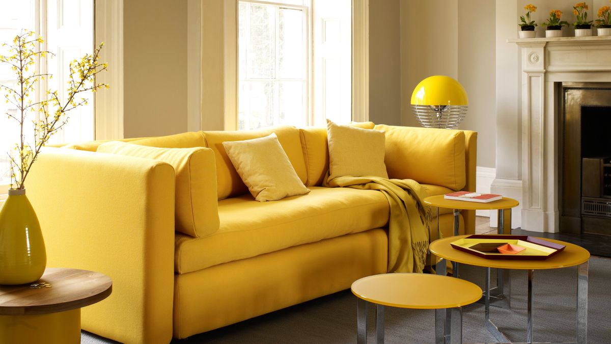
I’ve seen homeowners spend thousands on Farrow & Ball’s "Yellowcake" only to realize it’s so bright it vibrates. Design legend Abigail Ahern often talks about the "muddying" of colors—the idea that for a color to work in a real, lived-in home, it needs a bit of gray, black, or brown in the base to ground it. Without those "dirty" undertones, yellow just floats on the surface of the wall, looking cheap and plastic.
Why mustard is the "safe" bet that actually works
If you’re scared of the neon effect, you go for ochre or mustard. These aren't just "dark yellow." They are complex earth tones.
Think about the classic mid-century modern aesthetic. They used harvest gold and mustard because those tones play well with wood—teak, walnut, oak. When you use a mustard-heavy yellow colour living room palette, you aren’t just adding color; you’re adding a sense of history. It feels grounded. It feels like a library in an old English manor or a cool 1960s lounge in Palm Springs.
Stop painting all four walls
Seriously. Just stop.
One of the biggest misconceptions in modern home styling is that a "yellow room" must be entirely yellow. It doesn't. Sometimes, the most effective yellow colour living room isn't yellow at all—it's a crisp white room with one massive, buttery velvet sofa. Or maybe it’s a charcoal gray room with yellow ochre curtains that catch the light.
Color drenching is a huge trend right now—painting the walls, the ceiling, and the trim all the same color. It works with navy. It works with forest green. It is a death sentence with yellow. Unless you are a literal master of monochromatic design, painting your ceiling yellow will make the room feel like it’s collapsing in on you. The reflection of yellow light back onto itself (inter-reflection) increases the perceived saturation. Basically, the room gets yellower the longer you stay in it.
The "Banana" mistake and how to avoid it
You know that specific shade of yellow that looks like a ripe banana? It’s the most common mistake in DIY decor. People pick it because it looks "cheerful" on a two-inch paint swatch.
Pro tip: Always go two shades dustier than you think you want.
If you like a bright yellow, pick the version that looks a little bit like it has some tan in it. On the wall, in the shadows, it will look like the bright yellow you originally envisioned. If you pick the bright one on the swatch, it will look like a highlighter pen on the wall. It’s a weird quirk of human perception and pigment density.
Real-world examples of yellow done right
- The "English Country" Approach: Use a pale, buttery cream (which is really just a very desaturated yellow) on the walls. Pair it with sky-blue fabrics and dark antique wood. This is the classic Mario Buatta look. It’s timeless because the yellow is acting as a neutral, not a primary color.
- The "Modern Industrial" Vibe: Concrete floors, black steel windows, and a singular, "look-at-me" bright yellow rug. This works because the yellow provides the only warmth in a cold, sterile environment.
- The "Moody Ochre" Den: Dark, brownish-yellow walls in a room with low light. Instead of fighting the darkness, you embrace it. The room feels like a cocoon.
The psychology of the space
Color psychology is a real thing, but it’s often oversimplified. We’re told yellow is "happy." But did you know that intense yellow is also the color most likely to make babies cry or cause tempers to flare? It’s a stimulant. It ramps up your metabolism.
If your living room is where you go to decompress after a 10-hour shift at a high-stress job, a high-energy yellow colour living room might actually be the worst thing for your mental health. You might need a "quiet" yellow—think straw, parchment, or a very pale maize.
On the flip side, if you live in a place like Seattle or London where it’s gray eight months of the year, a warm yellow can be a legitimate counter to Seasonal Affective Disorder (SAD). It’s about context. It’s about where you live and how you use the space.
Texture is the secret weapon
A flat yellow wall is boring. It looks like a school hallway.
If you want a yellow colour living room that feels high-end, you have to bring in texture.
- Limewash: A yellow limewash paint creates a mottled, stone-like finish that diffuses light beautifully. It stops the color from being a "solid block" of aggression.
- Velvet: A yellow velvet chair has highlights and shadows. The color changes as you walk past it.
- Woven woods: Jute rugs or rattan furniture pull the "yellow" out of the natural fibers, making the whole room feel cohesive without needing more paint.
What designers won't tell you about maintenance
Yellow shows everything. Fingerprints on a yellow door? Obvious. Scuffs on a yellow baseboard? Painfully clear.
If you have kids or dogs, don't go for a flat matte yellow in high-traffic areas. Use a "scuff-tough" or eggshell finish. And please, for the love of all things holy, check your lightbulbs.
If you have a yellow colour living room and you use "Soft White" bulbs (which are actually quite yellow/orange), your room will look like it’s on fire at night. You want "Cool White" or "Daylight" bulbs (around 3500K to 4000K) to balance the warmth of the walls so the color stays true when the sun goes down.
Actionable steps for your yellow transformation
Don't just run to the hardware store. Start small.
First, identify your light. Spend a Saturday in your living room. Watch how the sun moves. If the room is dark most of the day, stay away from "bright" yellows—they will just look like dingy mustard in the shadows. Go for a yellow with a lot of white in it.
Second, buy samples. Not the tiny squares. Buy the actual small cans of paint. Paint a massive 3-foot by 3-foot square on at least two different walls. Look at them at 8:00 AM, 2:00 PM, and 9:00 PM with the lamps on. You will be shocked at how much the color shifts.
Third, choose your "anchor." If you’re going with yellow walls, your furniture should be grounded. Think navy blues, deep charcoals, or rich chocolate browns. If your walls are neutral, your "anchor" can be that big yellow statement piece.
Finally, remember the 60-30-10 rule. 60% of the room is your main color (usually a neutral), 30% is your secondary color (the yellow), and 10% is your accent (maybe a pop of teal or black). Following this prevents the "yellow-out" effect where the color swallows the architecture.
Yellow is a bold choice. It’s a statement that says you aren't afraid of a little personality. Just make sure it’s your personality and not a neon sign's.
To get started, look at your existing flooring. If you have "cherry" or "red" wood floors, a yellow wall will likely clash. If you have grayish or light oak floors, you have a green light. Map out the tones of your largest fixed elements before you ever touch a paintbrush. This is how you build a space that feels intentional rather than accidental.


