You'd think it’s just a bunch of rectangles. Honestly, the first time most people sit down to attempt a yellow brick road drawing, they assume it’s a beginner-level task. Just draw a path, color it gold, and you’re done, right? Not really. If you look at the original sketches by W.W. Denslow for L. Frank Baum’s 1900 novel The Wonderful Wizard of Oz, or the iconic 1939 Technicolor film set, the road isn't just a path. It’s a lesson in linear perspective and atmospheric depth.
Getting it right is harder than it looks.
Most amateur artists make the same mistake. They draw the bricks the same size from the bottom of the page to the top. It looks flat. It looks like a wall that fell over. To make a yellow brick road drawing actually feel like it’s leading to the Emerald City, you have to master the "vanishing point."
The Geometry of Oz: Mastering the Vanishing Point
The road doesn't stay the same width. It tapers.
In technical terms, we’re talking about one-point perspective. Imagine a dot on your horizon line. That’s your Emerald City. Every single longitudinal line of your road must aim directly for that dot. If your lines are parallel, the road will look like it's standing straight up in the air.
But here’s the kicker: the bricks themselves have to shrink too.
You’ve got to use "foreshortening." The bricks closest to the viewer should be large, wide, and detailed. You might even see the cracks or the texture of the stone. As you move toward the horizon, the horizontal lines (the "transversals") should get closer and closer together. By the time the road reaches the horizon, the bricks are basically just thin slivers of color.
Technicolor Isn't Just One Shade of Yellow
People reach for a lemon-yellow Crayon and call it a day. That’s a mistake. If you look at the actual history of the 1939 film, the "yellow" road was actually quite dull in person. Under the intense heat of the Technicolor lights, they had to use a very specific shade of high-gloss industrial paint.
When you’re working on a yellow brick road drawing, you need at least three shades.
- Mustard or Ochre: Use this for the shadows and the edges of the bricks.
- True Yellow: This is your mid-tone.
- Cream or White: This is for the "specular highlights" where the light hits the top of the stone.
Without highlights, it’s just a yellow stripe. With them, it’s a road made of individual, heavy stones.
Denslow vs. MGM: Which Version Are You Drawing?
There are two main "vibes" for this.
The W.W. Denslow illustrations from the original book are much more whimsical. The road is often shown as a narrow, winding path through a highly stylized forest. The bricks are rounded, almost like cobblestones. It feels folk-art inspired. It’s less about "gold" and more about the journey through a strange, unfamiliar land.
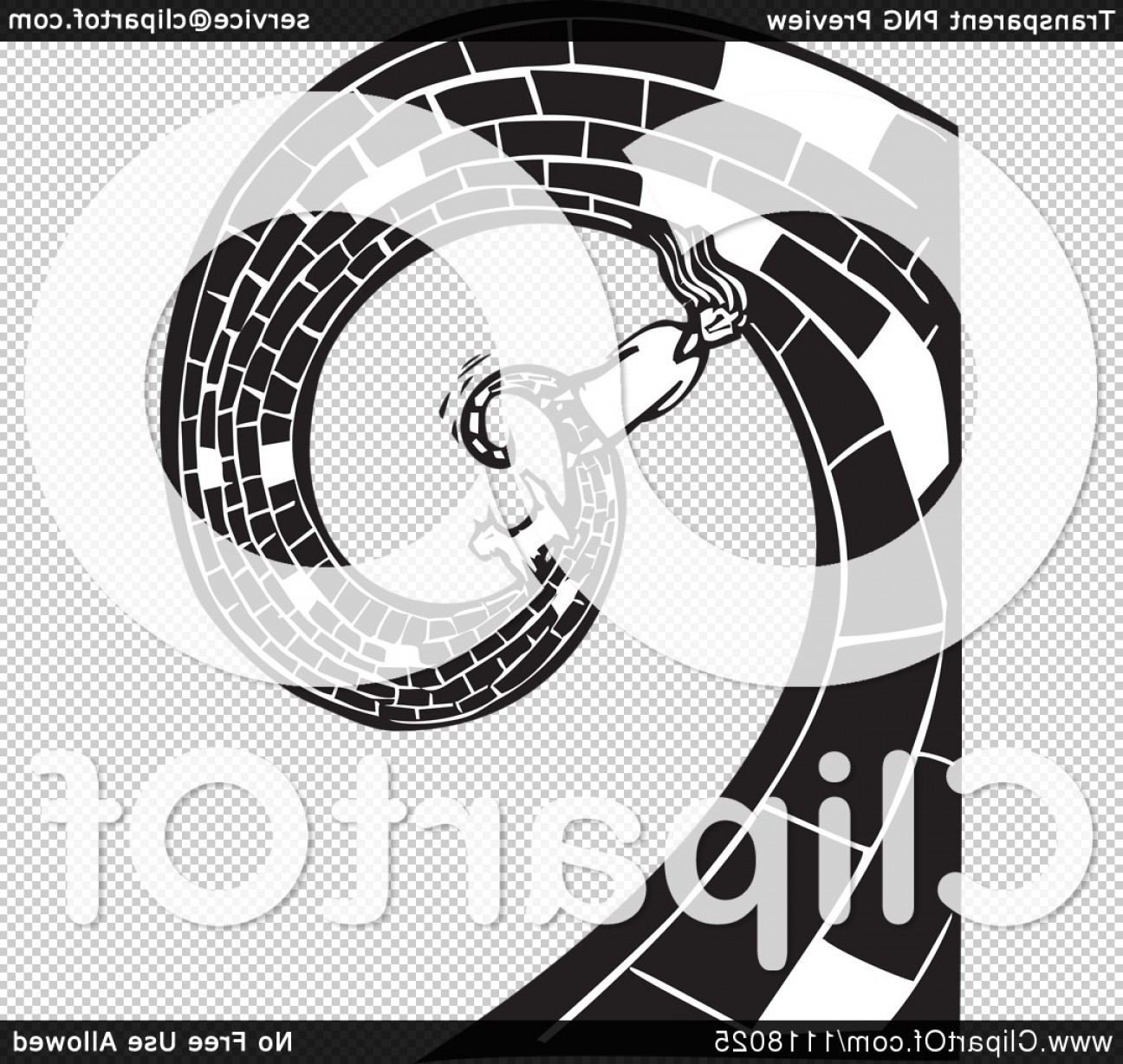
Then there’s the MGM movie version. That road is a massive, spiraling highway. It starts in a tight coil in Munchkinland—which is a nightmare to draw, by the way—and expands into a wide, ceremonial-looking thoroughfare. If you're drawing the movie version, the bricks are crisp rectangles. They look like they were laid by a professional mason.
Common Pitfalls in Your Yellow Brick Road Drawing
Don't make the road perfectly straight.
A straight road is boring. It lacks the "sweep" of the movie. If you want that classic Oz feel, give the road a gentle "S" curve. This adds "rhythm" to the composition. It guides the viewer’s eye through the frame, rather than just pointing them at the center.
Another thing? Don't forget the grout.
The space between the bricks matters as much as the bricks themselves. In the 1939 film, the "grout" is often a darker, slightly brownish or gray tone. This provides the contrast needed to make the yellow pop. If you just draw yellow bricks against a white background, the whole thing washes out.
Putting It All Together: A Step-by-Step Approach
- Sketch the Horizon: Draw a light horizontal line across your paper, about two-thirds of the way up.
- Set the Vanishing Point: Place a small dot on that line. This is where your road ends.
- The Outlines: Draw two lines starting from the bottom corners of your page that meet at that dot.
- The Bricks: Start at the bottom. Draw wide, tall rectangles. As you move up, make them shorter and narrower.
- The Spiral (Optional): If you’re doing the Munchkinland start, draw a spiral first, then "slice" it into brick shapes later.
- Coloring: Layer your colors. Start with a light wash of tan or ochre, then add the bright yellow on top, leaving the very tops of the bricks white for a "shiny" effect.
Actionable Tips for Your Next Oz Piece
To take your yellow brick road drawing to the next level, stop thinking about it as a road and start thinking about it as a mirror. The yellow bricks should reflect the sky. If you have a bright blue sky, add a tiny hint of light blue or purple into the shadows of the yellow bricks. This makes the scene feel cohesive and "real," even though it’s a fantasy landscape.
Check your references. Look at high-definition stills from the 4K restoration of the film. You’ll see that the road isn't perfectly clean. There’s dirt, scuff marks from Judy Garland’s ruby slippers, and uneven textures. Adding these small "imperfections" is what makes a drawing look human rather than AI-generated.
Focus on the weight of the stones. These are heavy bricks. Give them a bit of a "3D" edge by drawing a tiny side-plane on the bricks closest to the viewer. This adds "form" and makes the road feel like something you could actually walk on.
Avoid using a ruler for every single line. Oz is a magical, slightly wonky place. A bit of hand-drawn "jitter" in your lines gives the piece character and prevents it from looking like a technical blueprint.