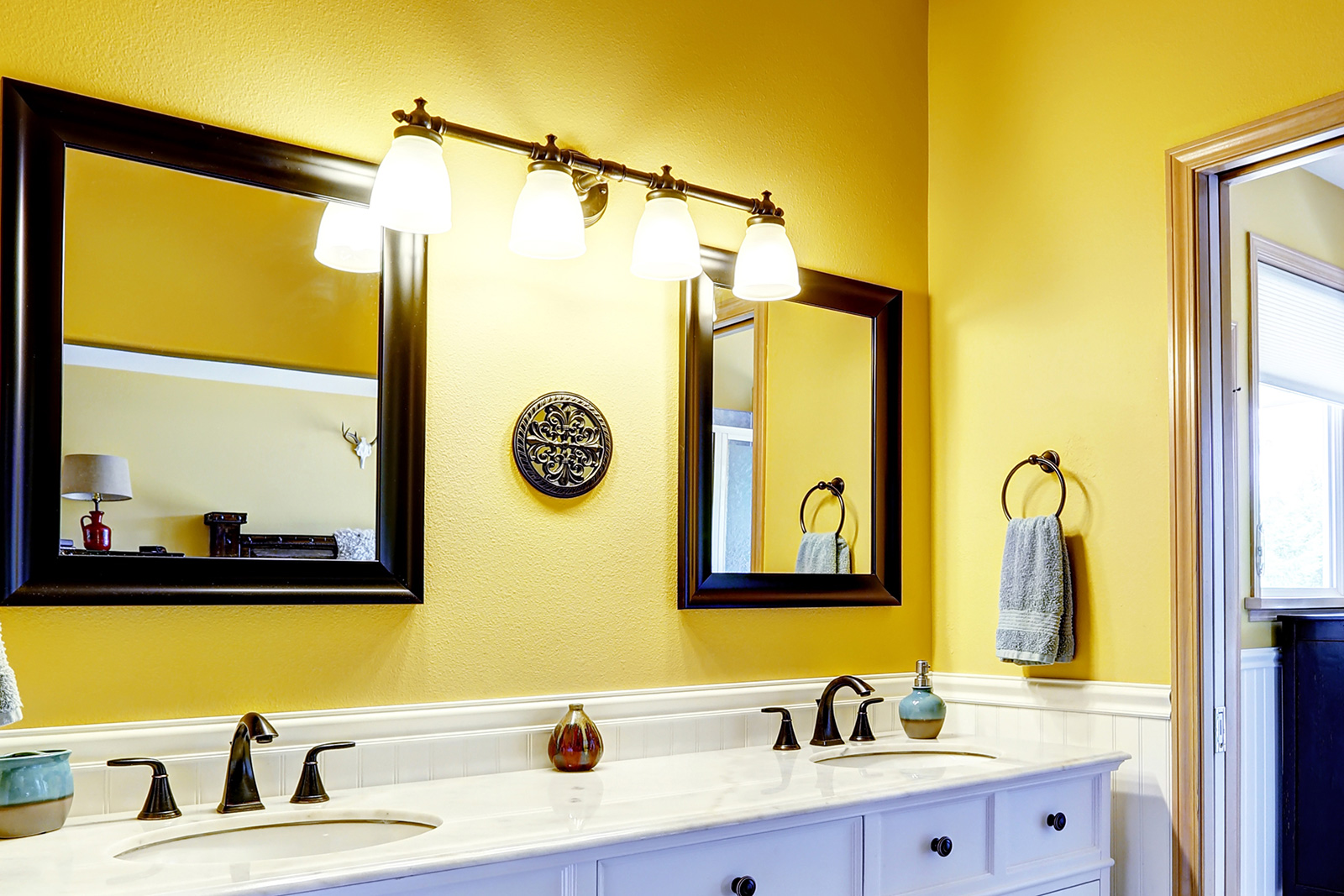
Yellow is tricky. It’s the color of sunshine and joy, but in a small, windowless bathroom, it can quickly turn into the color of a neon highlighter or, worse, a dated 1970s disaster. Most people approach decorating a yellow bathroom with a bit of fear. They worry it’ll be too loud. They worry it’ll make their skin look slightly jaundiced in the vanity mirror. Honestly? Those are valid concerns. But when you get the saturation and the pairing right, a yellow bathroom is probably the most mood-boosting room in a house. It’s a morning person’s dream.
I’ve seen bathrooms where the homeowner went "full bumblebee" with bright yellow tile and black accents. It's bold. It’s also exhausting. On the flip side, a soft, buttery primrose can make a cramped powder room feel like it’s glowing from within. The secret isn't just picking a paint chip; it’s about managing light, texture, and what designers call "visual weight." If you have a primary bathroom with tons of natural light, you can go vibrant. If you’re working with a basement half-bath, you need to be way more strategic. Also making waves recently: Why Elon Musk Ditched the Morning Donuts For Steak and Eggs.
The Science of Why Yellow Bathroom Decorating Works
There’s a reason we gravitate toward this palette. Color psychologists, like the late Angela Wright who developed the Color Affects System, have long noted that yellow is the strongest color psychologically. It hits the nervous system first. It’s literally stimulating. In a bathroom—a place where we go to wake up or refresh—that stimulation serves a functional purpose.
But here is what most people get wrong about decorating a yellow bathroom: they forget about the "Reflective Value." Yellow has a high Light Reflectance Value (LRV). If you paint four walls in a small space a bright lemon, the color bounces off itself. It intensifies. That soft yellow you liked on the tiny swatch? It will look twice as bright once it's on all the walls. This is why many professional designers, like those featured in Architectural Digest or Elle Decor, often suggest going two shades lighter than the one you think you want. More information into this topic are explored by Refinery29.
Picking the Right Undertone
Don't just grab "Yellow." That doesn't exist. You’re choosing between a green-yellow, an orange-yellow, or a brown-yellow.
- Cool Yellows: These have a greenish tint. Think Citron or Lemon. They feel modern and crisp. They look amazing with chrome fixtures and white marble.
- Warm Yellows: These lean toward orange or gold. Saffron, Ochre, and Mustard. These are "moody" yellows. They feel cozy. If you have oil-rubbed bronze or brass faucets, this is your lane.
- Muted Yellows: These are basically neutrals with a yellow soul. Cream, Straw, or Champagne. These are the safest bet if you’re worried about resale value but still want that warmth.
Real-World Yellow Bathroom Decorating Ideas That Stay Classic
Let’s talk about the "Sunflower" problem. You don't want your bathroom to look like a themed B&B from 1994. To avoid this, you have to break up the color. One of the most effective ways to handle decorating a yellow bathroom is the 60-30-10 rule, but with a twist.
Maybe 60% of your room is a crisp, cool white (the tiles, the tub, the sink). Then, 30% is your yellow—perhaps a bold, lacquered vanity or a stunning wallpaper. The final 10% should be a grounding "interruptor" color. Navy blue is the classic choice here. Why? Because they are opposites on the color wheel. Navy stabilizes the "vibration" of yellow. It gives the eye a place to rest.
Black accents work too. Think industrial. A yellow clawfoot tub with matte black feet and a black framed mirror? That’s high-end. It moves away from "sunny" and toward "sophisticated."
The "Half-Wall" Strategy
If you're terrified of commitment, don't paint the whole wall. Use wainscoting or subway tile on the bottom half. Keep that bottom half white. Then, put your yellow on the top half. This prevents the "yellow box" effect where the color feels like it’s closing in on you. It also keeps the yellow away from your face when you’re looking in the mirror, which helps with the whole "looking healthy" thing while you do your makeup or shave.
Textures and Materials That Love Yellow
Yellow is a flat color if you aren't careful. To make it look "human-quality" and expensive, you need texture.
- Natural Wood: Oak and maple have natural yellow undertones. They disappear. Go for Walnut or Teak. The dark, rich grain of walnut against a mustard wall is incredible. It feels mid-century modern and intentional.
- Concrete: If you have a bright, acid-yellow wall, a grey concrete sink or floor grounds it. It turns "cheery" into "urban."
- Brass and Gold: This is controversial. Some say it's too much yellow. I disagree. If you use a matte brushed gold against a pale yellow, it creates a monochromatic, layered look that feels very boutique hotel.
Lighting Changes Everything
You cannot talk about decorating a yellow bathroom without talking about bulbs. This is a technical trap. If you use "Warm White" bulbs (around 2700K), they have a yellow cast. Put those in a yellow room, and everything turns into a muddy mess. You want "Daylight" or "Cool White" bulbs (3500K to 4000K). These provide a blue-ish light that balances the yellow walls, making the color look true to the paint can rather than sickly.
Common Mistakes to Avoid
One huge mistake? Matching your towels exactly to the paint. Don't do it. It looks like a cheap hotel. If your walls are yellow, your towels should be white, charcoal, or even a deep forest green. Contrast is your friend.
Another one is ignoring the ceiling. In a yellow bathroom, a stark white ceiling can sometimes feel like a harsh lid. Consider "tinting" your ceiling paint with just a drop of the wall color. It softens the transition and makes the room feel taller.
And please, watch out for the "Yellow Reflection" on your skin. If you have a yellow wall directly opposite your main mirror, the light will bounce off that wall and onto your face. You will look tired. Every day. The fix? Keep the wall with the mirror white, or use high-quality, side-mounted sconces that wash your face in neutral light before the wall color can interfere.
Making Small Spaces Feel Large with Yellow
Can you use yellow in a tiny powder room? Yes. But go bold or go home. In small spaces, light yellows can sometimes just look like "dirty white" if there isn't enough light. A deep, saturated Ochre or a bright Marigold actually creates a "jewel box" effect. It’s an experience. People walk in and go "Wow," rather than "Oh, this is a bit yellow, isn't it?"
Pair a bold yellow with floor-to-ceiling white tiling. The vertical lines of the grout will draw the eye up, and the yellow will provide the "pop" that makes the room feel curated.
Actionable Steps for Your Yellow Bathroom Project
If you're staring at your bathroom right now and thinking about making the jump, here is how you actually execute without ending up with "Regret Yellow."
Step 1: The Swatch Test. Buy three samples. One you love, one that’s "too bright," and one that’s "too dull." Paint 2-foot squares on different walls. Look at them at 8 AM, 2 PM, and 9 PM with the lights on. You’ll be surprised which one wins. Usually, it’s the "too dull" one.
Step 2: Hardware First. Before you paint, decide on your metal. If you're keeping old chrome, stick to cooler, citrus yellows. If you’re upgrading to black or brass, you can go into the warmer, spicy yellows like turmeric or honey.
Step 3: Soft Goods Layering. Buy your shower curtain last. It’s the largest piece of fabric in the room. If the yellow walls feel too intense once finished, get a white curtain with a subtle yellow pattern. If the walls feel too pale, get a solid, dark-colored curtain to provide contrast.
Step 4: Add Life. Yellow is an organic color. It needs plants. The green of a Sansevieria (Snake Plant) or a Pothos looks stunning against yellow. The chlorophyll-green literally vibrates against the yellow, making the room feel "alive" rather than just "painted."
Step 5: Evaluate the Floor. If you have ugly brown tile, yellow might make it look worse. If the floor is a problem, use a large, neutral bath mat to cover as much of it as possible. White or grey rugging will "cut" the yellow and keep the focus on the walls and decor rather than the floor.
Decorating with this palette is about confidence. It’s about realizing that "bright" doesn't have to mean "overwhelming." By controlling your light sources and being intentional with your "interrupor" colors like navy, black, or white, you create a space that feels curated. It's a high-reward design choice that, when done with a bit of restraint, results in the most cheerful room in the house.