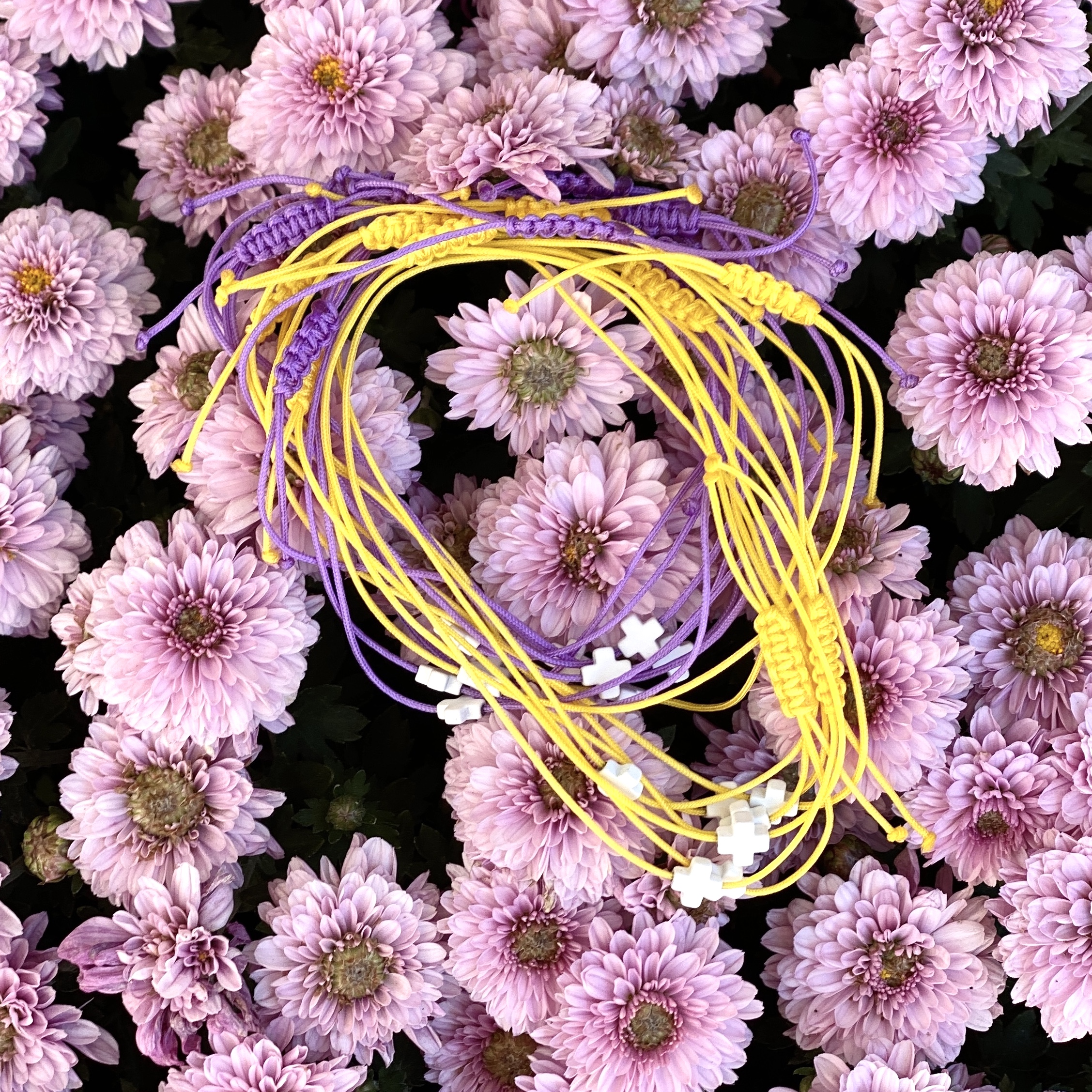
You’ve seen it. It’s hard to miss. Whether it’s the iconic jersey of the Los Angeles Lakers or a cluster of crocuses pushing through a late winter snowbank, yellow and purple is a color combination that demands your attention immediately. It’s loud. It’s jarring. Honestly, for some people, it’s a bit much. But there is a very specific, scientific reason why these two colors vibrate when they sit next to each other. They are literal opposites. On a standard RYB color wheel, they sit directly across from one another, making them complementary colors.
When you put them together, they create the highest level of contrast possible. This isn't just about "matching." It's about how the human eye processes light.
The Science of Why Yellow and Purple Pop
Our eyes are weird. We have photoreceptors called cones that pick up different wavelengths of light. When you stare at a bright yellow shape for a long time and then look at a white wall, you’ll see a purple afterimage. This is because your "yellow" receptors get tired, leaving the others to fill in the gaps. This physiological quirk is why yellow and purple feel so energetic. They balance each other's intensity. Yellow is the lightest hue on the spectrum, carrying the highest luminosity. Purple, specifically in its deeper violet forms, is the darkest. Putting them together is like a visual shout.
It’s not just a random design choice. It’s physics.
Historically, this pairing hasn't always been accessible to everyone. Purple was famously expensive. Back in the day—we're talking Phoenician times—purple dye came from the mucus of sea snails. Thousands of them. It was so pricey that only royalty could afford it. Yellow, meanwhile, was often made from ochre or even toxic lead, but it was far more common. Combining the two was a display of massive wealth. It said, "I have the gold, and I have the rarest dye in the known world."
Nature’s Warning and Invitation
Nature doesn't care about fashion trends, but it loves efficiency. Think about pansies or Irises. These flowers use a yellow and purple palette to act as a landing strip for pollinators. Bees see ultraviolet light, so the contrast between a deep violet petal and a bright yellow center is like a neon "Open" sign at a 24-hour diner. It’s high-visibility signaling at its finest.
But it’s also a warning. Some poisonous caterpillars or tropical fish use high-contrast patterns to tell predators, "Don't eat me, I'll make you regret it." In the wild, high contrast usually means high stakes.
Impact on Interior Design and Mood
If you’re thinking about painting a room this way, be careful. Using equal amounts of both can make a space feel frantic. It’s a lot for the brain to process at 7:00 AM. Designers usually recommend the 60-30-10 rule. Maybe 60% of a neutral tone, 30% of a muted lavender, and just 10% of a punchy mustard yellow. Or vice versa.
I once saw a kitchen with deep plum cabinets and brass hardware—which is basically a metallic yellow—and it looked incredibly sophisticated. If those cabinets had been bright "Barney" purple, it would have looked like a daycare. Saturation matters. A lot.
- The Lavenders and Butters: This is the "cottagecore" approach. It’s soft, it’s airy, and it doesn't trigger a migraine.
- The Royal Approach: Deep eggplant paired with metallic gold. This feels heavy, expensive, and serious.
- The Retro Pop: Neon violet and lemon yellow. This screams 1980s surf culture or high-end athletic wear.
Kinda amazing how the same two colors can feel like a nap or a rock concert just by changing the shade.
Color Theory and the "Lakers" Effect
We can’t talk about yellow and purple without mentioning sports branding. The Lakers chose these colors (originally "Royal Purple" and "Aztec Gold") because they wanted to evoke a sense of royalty and excellence. But from a purely functional standpoint, it makes the players incredibly easy to track on a fast-moving court.
In the world of marketing, this pairing is often used to signify "premium" but "creative." It’s less stuffy than blue and white, but more established than orange and green. Think about Hallmark. They’ve used purple for decades to lean into that "regal" feeling, often accented with gold or yellow to keep it from feeling too somber.
Why People Get It Wrong
The biggest mistake people make? Using the most "pure" versions of both colors at the same time.
If you use a primary yellow and a primary purple, they fight. Your eye doesn't know where to rest. To make it work in a "human-quality" way, you have to play with the tints and shades. Try a "dusty" purple with a "honey" yellow. The gray undertones in the dusty purple act as a bridge, making the yellow feel warm rather than piercing.
Also, lighting changes everything. Under warm incandescent bulbs, purple can start to look muddy or even brown, while yellow looks even more orange. Under cool LEDs, the yellow might look greenish and sickly, while the purple pops. You’ve gotta test these colors in the actual light where they’ll live.
Actionable Tips for Using This Duo
If you want to experiment with this high-contrast pair without overhauling your entire life, start small.
- For your wardrobe: Try a navy-purple tie with a small yellow pattern, or a yellow sundress with an amethyst necklace. It’s subtle but intentional.
- In the garden: Plant "Dutch Master" daffodils alongside "Purple Sensation" alliums. They bloom around the same time and create a stunning professional-looking landscape with zero effort.
- For digital design: Use purple for your background and yellow for your "Call to Action" buttons. It is one of the highest-converting color combinations because the yellow button practically jumps off the screen.
- In your home: Use a single yellow throw pillow on a deep violet armchair. It’s a classic "designer" trick to make a room look finished.
Basically, stop treating these two like they're too much to handle. They’re a tool. When you want something to be seen, you go for the contrast. When you want it to feel expensive, you deepen the shades. Just remember that yellow is the light and purple is the shadow—as long as you keep that balance, you really can't mess it up.
Next time you’re out, look for this pairing in the wild. You’ll start seeing it everywhere, from fast-food logos to high-end fashion runways. It’s one of the oldest tricks in the visual playbook for a reason: it works.


