You’re standing over a palette, or maybe a bucket of house paint, or perhaps you're just messing around with some digital sliders in Procreate. You want something fresh. Something that feels like a lime or a sun-drenched meadow. Naturally, you reach for the yellow and the green. But what actually happens when they hit? Honestly, the answer to what colour does yellow and green make is both simpler and more complex than most people realize. You're going to get a yellowish-green, often called lime green or chartreuse. But that’s just the surface level.
Color is tricky. It isn't just one thing. It's light, it's pigment, and it’s how our brains process those weird little waves of energy hitting our retinas. If you mix a neon yellow with a deep forest green, you aren’t getting the same result as a pale primrose mixed with a minty teal. It’s all about ratios. It's about the "bias" of the colors you start with.
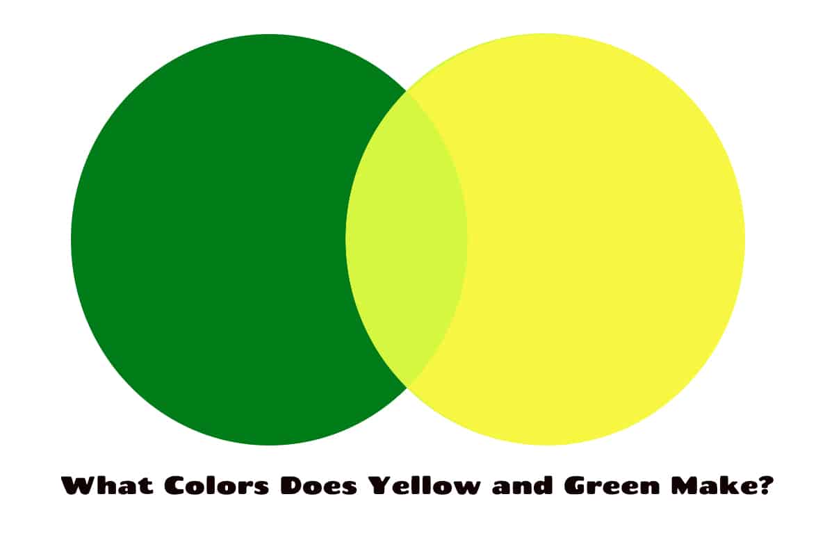
The Science of the "In-Between"
When we talk about what colour yellow and green make, we are technically talking about a tertiary color. In the traditional RYB (Red, Yellow, Blue) color model that we all learned in elementary school, yellow is a primary color. Green is a secondary color, born from the marriage of blue and yellow. So, when you add more yellow to that green, you're essentially just tilting the scales. You are making a "yellow-green."
It has a fancy name in the art world: a tertiary color. These are the six colors created by mixing a primary and a secondary color. Yellow-green sits right there on the color wheel between its two parents. Depending on who you ask—a fashion designer, a web developer, or an oil painter—they might call it Spring Green, Lime, Chartreuse, or even Pistachio.
Understanding Pigment vs. Light
Here is where it gets a bit wonky. Mixing paint is different from mixing light. If you are a digital artist, you’re working with the RGB (Red, Green, Blue) model. In RGB, green is actually a primary color. Yellow is made by mixing red and green light. Wait, what? Yeah, it's true. If you take a green spotlight and a red spotlight and overlap them, the intersection is bright yellow. So, if you’re asking what colour does yellow and green make in a digital space, you’re basically just shifting the hue. You're increasing the red values in your green light until it warms up into a lime or a bright lemon-lime.
Subtractive mixing—the stuff with physical paint—is what most of us are doing at the kitchen table. In this world, we use the CMYK (Cyan, Magenta, Yellow, Black) or the RYB model. Here, green is a "subtractive" result. It absorbs certain wavelengths of light and reflects others. Adding yellow to green increases the amount of light being reflected in the long-wave end of the spectrum. It makes the color "lighter" and "warmer."
It’s All About the Chartreuse
If you’ve ever looked at a bottle of the French liqueur Chartreuse, you’ve seen the literal embodiment of this mix. There are actually two types: Green Chartreuse and Yellow Chartreuse. The color that sits right in the middle—that electric, almost vibrating yellowish-green—is what we’re talking about.
Why does this color feel so intense? It’s because the human eye is actually most sensitive to wavelengths in the green-yellow part of the spectrum. Evolutionarily, this made sense. Our ancestors needed to distinguish between different types of foliage, ripe fruits, and predators hiding in the grass. Because we see this specific range so well, yellow-green can feel very loud. This is why high-visibility safety vests are often that specific shade. It’s not just "bright," it's literally hitting the peak of our visual sensitivity.
The Impact of Color Bias
Not all yellows are created equal. This is the secret that professional painters like James Gurney or Richard Schmid talk about in their books. If you take a "cool" yellow (like Cadmium Yellow Light or Lemon Yellow, which has a slight green bias) and mix it with a "cool" green (like Phthalo Green, which has a blue bias), you get an incredibly vivid, crisp lime.
But try this instead: take a "warm" yellow (like New Gamboge or Yellow Ochre, which leans toward orange) and mix it with a "warm" green (like Sap Green, which has earthy, brown undertones). Suddenly, you aren't getting lime anymore. You're getting an olive, or a mossy, swampy gold. It’s still a yellow-green, technically. But the vibe is completely different. One screams "tropical vacation," the other screams "medieval tapestry."
What Colour Does Yellow and Green Make in Design?
In the world of interior design and branding, this mixture is a powerhouse. It’s often used to represent growth, freshness, and energy. Think about brands like Sprite or Subway. They use the interplay of yellow and green to signal something crisp and "natural," even if the product is a processed soda.
If you're painting a room, you have to be careful. A yellow-green can be tricky. In a small bathroom with poor lighting, a heavy yellow-green can start to look, well, a bit sickly. It can pick up "bilious" undertones. But in a sunroom? It brings the outside in. It glows.
- Lime Green: High energy, youthful, very high yellow content.
- Olive: Low light, high green content with a touch of red or black.
- Pear: A softer, more muted version, usually with a bit of white (tint) added.
- Avocado: A 1970s classic, which is basically green and yellow with a heavy dose of black or umber.
The Psychology of the Mix
Color psychology is a bit of a "soft science," but there’s some consensus here. Yellow is generally associated with happiness and optimism. Green is the color of stability and nature. When you mix them, you get the "optimism of growth." It’s the color of a sprout pushing through the dirt in April.
However, because it’s so close to the color of certain fluids the body produces when it’s not doing great, people have a love-hate relationship with it. It’s a polarizing color. You rarely find someone who is "okay" with chartreuse. They either want their entire house painted in it, or they want it banned from the planet.
Mixing at Home: A Practical Guide
If you're actually sitting there with some acrylics trying to figure out what colour does yellow and green make for your project, here is the move.
- Start with the yellow. It is always easier to make a light color darker than it is to make a dark color lighter. Yellow has a lower tinting strength than green. If you have a big glob of green and you start adding tiny bits of yellow, you’ll be there all day and use half your tube of yellow before you see a change.
- Add green in tiny increments. Seriously. Just a toothpick-sized amount of green can transform a puddle of yellow.
- Check for "mud." If your mixture looks gray or brownish, your green likely has a lot of red in it. Red is the complement of green. When you mix all three primaries (Yellow + Blue from the green + Red), you get brown. To keep it bright, make sure your green is "clean."
Real-World Examples of the Mix
Look at a Granny Smith apple. That’s the classic 50/50 split. Look at a tennis ball. That’s actually officially called "Optic Yellow," but if you look closely, it's heavily leaning into the green territory. In fact, there was a massive debate on the internet a few years ago—similar to "The Dress"—about whether tennis balls are yellow or green. The fact that the debate even exists proves how perfectly balanced that yellow-green mixture is.
In nature, we see this everywhere. The "new growth" on a pine tree in the spring is a brilliant yellow-green compared to the dark, bluish-green of the old needles. It’s nature’s way of saying, "I’m new here!"
Why Understanding This Mixture Matters
Knowing what colour does yellow and green make isn't just for artists. It’s for anyone who wants to understand the visual world. If you’re a gardener, you look for yellow-green leaves as a sign of iron deficiency (chlorosis) in plants. If you’re a fisherman, you might use a "chartreuse" lure because you know it's the most visible color in murky water.
It's a color of utility and a color of extreme beauty. It’s the color of the aurora borealis, where charged particles hit the atmosphere and glow in that haunting, electric yellow-green. It’s the color of a firefly’s abdomen in the middle of July.
Moving Beyond the Basics
To truly master this, you have to stop thinking of "yellow" and "green" as static things. They are ranges. A lemon is yellow, but so is a school bus. A lime is green, but so is a deep emerald.
If you want a sophisticated yellow-green, try adding a tiny drop of white or a tiny drop of "burnt sienna" to the mix. The white will turn it into a "tint," making it look like a "Mint Cream" or "Pale Primrose." The burnt sienna will "desaturate" it, making it look like a "Dried Sage" or "Moss." This is how you move from "kindergarten finger paint" results to "high-end interior design" results.
Summary of Insights
- Yellow + Green = Yellow-Green (Tertiary).
- Names vary: Chartreuse, Lime, Spring Green, Pistachio.
- Sensitivity: This is the color range humans see most clearly.
- Digital vs. Physical: In RGB, yellow is actually made from green and red. In paint, green is the base you modify with yellow.
- Bias matters: Cool yellows + cool greens = bright results. Warm yellows + warm greens = earthy results.
Actionable Next Steps
To see this in action and master your own color mixing, try these three things:
- The 90/10 Test: Place a large dollop of Lemon Yellow on a piece of paper. Add the tiniest speck of Forest Green. Observe how quickly the yellow "turns." This teaches you about tinting strength.
- The Light Check: Take something yellow-green (like a lime or a highlighter) and look at it under incandescent (yellow) light versus LED (blue/white) light. Notice how the "greenness" seems to disappear or intensify.
- The Complementary Pop: If you use a yellow-green in a design or a painting, put a tiny bit of purple (its opposite on the color wheel) next to it. It will make the yellow-green look like it's glowing.
Understanding the relationship between these two colors is a fundamental building block for any visual task. Whether you're dressing for an interview and want to look "approachable yet energetic" or you're trying to mix the perfect shade for a landscape painting, the marriage of yellow and green is one of the most vibrant tools in your kit.


