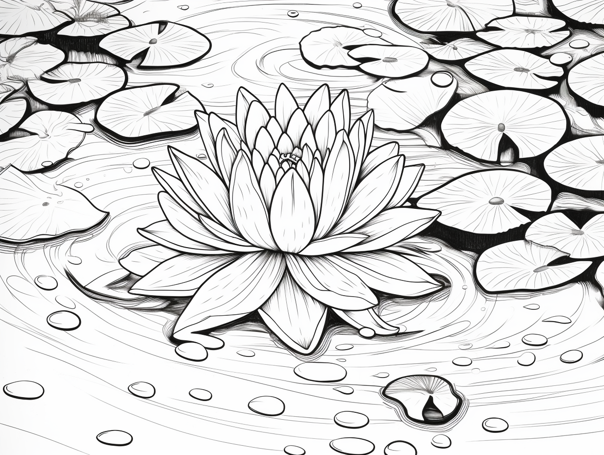
You’ve seen them in every Monet painting. Those floating green discs that look so peaceful, so simple, yet when you sit down to actually draw a lily pad, things go south fast. It usually ends up looking like a green circle with a slice of pizza missing. Or worse, a weirdly squashed lime.
Drawing nature is tricky because nature isn't perfect.
Honestly, the biggest mistake people make is thinking a lily pad is a circle. It isn't. If you look at a real Nymphaeaceae (that’s the fancy botanical family name), you’ll see they are messy. They have tears. They have veins that look like lightning bolts. They have edges that curl up because they are trying to keep the water out.
The Geometry of a Floating Leaf
Stop drawing circles.
Start with an oval. Since you’re usually looking at a pond from the side, perspective squashes the shape. This is basic foreshortening. If you draw a perfect circle, it looks like the lily pad is standing up to look at you. Unless you’re drawing a cartoon for a very specific reason, stick to the ellipse.
Why the "V" Cut Matters
The most iconic feature when you draw a lily pad is that notch. It’s called a sinus. It isn't just a random triangle. The stem of the plant actually connects right at the base of that notch, underneath the water.
When you draw this, don’t make the lines perfectly straight. Give them a little wobble. In the real world, insects nibble on these things. Wind tears them. Frogs weigh them down. If your lines are too clean, the drawing feels sterile and fake.
Imagine you're drawing a "C" that almost closes, but instead, the ends dive inward toward the center. That’s the soul of the shape.
Lighting is the Secret Sauce
Water is reflective. Lily pads are waxy.
Because the surface of a lily pad has a cuticular layer—a waxy coating that repels water—it reflects the sky. This means your green leaf isn't just green. It's probably got some blue in it. Maybe some white highlights where the sun hits the "rim" of the leaf.
If you're using colored pencils or paint, don't just grab "Grass Green." Grab a teal. Grab a muddy brown for the edges.
Think about the shadow. A lily pad isn't glued to the water; it floats. There is a tiny, tiny gap between the leaf and its reflection. If you draw a dark, soft shadow right under the edge, the leaf suddenly "pops" and looks like it's actually floating.
Vein Patterns: The Map of the Leaf
The veins don't just go straight out like spokes on a bicycle. They radiate from the center point (where the notch meets) and they fork.
They fork again.
And again.
It’s a fractal pattern. If you’re doing a detailed sketch, these veins should be lighter than the rest of the leaf. Or, if the leaf is old, the veins might be indented and darker. Pay attention to how the veins follow the curve of the oval. They should wrap around the shape, which helps define the 3D volume of the leaf.
Dealing with the Environment
A lily pad alone is just a shape. A lily pad in a pond is a story.
You need ripples.
Don't overdo it, though. A few thin, horizontal lines around the base of the pad are enough to suggest movement. If you're drawing a frog on top, the pad should dip slightly. The water should rise just a bit around the edges of the frog’s feet. This is called surface tension, and capturing it is what separates amateurs from pros.
Common Pitfalls to Avoid
- Uniformity: Don't make every lily pad the same size. In a real pond, you have tiny babies and massive giants.
- Spacing: Avoid "polka dot" syndrome. Don't space them out perfectly. Let them overlap. Let some be half-hidden.
- The Stem: Sometimes you can see the stem snaking down into the dark water. Use a darker, blurred line for this to show depth.
Perspective and the Horizon
Where is your eye level?
If you are "standing" on the bank, the lily pads closest to you will be large and wide ovals. As they move toward the background, they get smaller and flatter. Eventually, they just become thin green slivers on the horizon.
This is linear perspective. It’s what gives your drawing "air." Without it, everything feels like it's smashed against a windowpane.
Texture and Final Touches
Real lily pads often have "bruises." They have yellowing edges where they are starting to decay. They have little droplets of water that bead up like mercury because of that waxy coating I mentioned earlier.
When you draw a lily pad, adding one or two water droplets makes a massive difference. Draw a tiny circle. Darken the top. Put a tiny white dot (a highlight) at the bottom. Boom. Realism.
Also, consider the underside. If a lily pad is flipped over by the wind, the bottom is often a deep purple or a duller, veiny red. It's a great way to add a splash of unexpected color to a mostly green composition.
Actionable Steps for Your Next Sketch
- Start with the "Squashed" Oval: Draw five ellipses of different sizes and widths to practice foreshortening.
- The Off-Center Notch: Place the "V" notch slightly to one side rather than perfectly in the middle to create a more dynamic angle.
- Layer Your Greens: Use a yellow-green for the areas hit by light and a deep forest green or indigo for the parts in shadow or underwater.
- Add the "Rim": Draw a very thin, slightly lighter line around the outer edge to represent the thickness of the leaf.
- Ground It: Place a dark, blurred horizontal line directly underneath the pad to create the illusion of it sitting on a liquid surface.
Experiment with different species. The Victoria amazonica has massive upturned edges that look like a cake pan, while the common white water lily is much flatter. Changing the edges changes the whole "personality" of the plant.