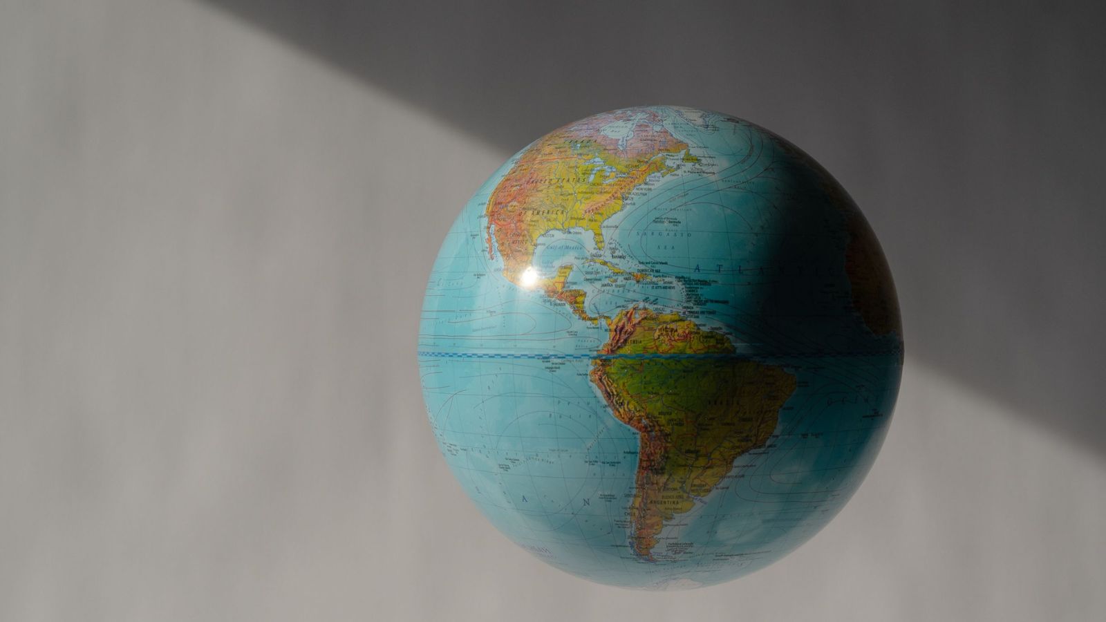
Look at a classroom wall. Pull up a digital globe on your phone. Open a navigation app to find your way across town.
You are staring at a falsehood.
It is a distortion so old, so thoroughly baked into our daily lives, that we never think to question its geometry. For more than four centuries, most of the world has relied on a single cartographic blueprint designed to help 16th-century sailors steer wooden ships across stormy Atlantic waters. It is called the Mercator projection. And in its quiet, systematic way, it has lied to generations about the true scale of our planet.
Consider what happens when you look at Africa on a standard flat world map. It appears roughly the same size as Greenland. Sometimes, depending on the projection, it even looks smaller than North America.
It is a visual trick. A grand illusion.
In reality, you could fit the entire landmass of the United States, China, India, Japan, and most of Europe neatly inside the borders of Africa, with room to spare. Greenland? Greenland is roughly the size of the Democratic Republic of the Congo alone. Yet generations of school children grew up believing that the massive landmasses of the global North dominated the Earth, while the continents clustered near the equator were modest patches of earth easily overlooked.
This is not a harmless academic quirk. Maps are arguments disguised as paper. They tell us who matters, who is central, and who is peripheral. When an entire continent housing over a billion people is visually shrunken to the dimensions of a minor island, the psychological impact seeps into our collective unconscious. It breeds an invisible hierarchy.
Gerardus Mercator did not invent his map out of malice in 1569. He was a mathematician trying to solve a brutal geometric puzzle. How do you take a three-dimensional sphere—our spinning, breathing Earth—and flatten it onto a two-dimensional sheet of paper without tearing the continents apart?
You cannot. Something has to give.
Mercator chose to preserve angles and navigational direction. If a sailor wanted to sail a straight compass bearing from Lisbon to the Caribbean, the Mercator map allowed them to draw a straight line and follow it. But the mathematical price for that convenience was severe stretching at the poles. As you move away from the equator toward the top and bottom of the map, landmasses balloon exponentially.
Greenland sits comfortably near the Arctic, so it swells to the size of a continent. Europe stretches outward, gaining an inflated sense of continental grandeur. Meanwhile, Africa and South America, straddling the equatorial line where the math remains relatively true, are compressed into deceptively modest footprints.
For centuries, we accepted this trade-off because navigation required it. But we live in a digital age. We have satellite telemetry, GPS, and computational power that can render our planet with breathtaking accuracy. Yet the old colonial-era proportions persist on our walls, in our textbooks, and in our media.
Change, however, is finally clawing its way into the light.
The United Nations and a coalition of international cartographers, educators, and equity advocates are pushing hard to correct the record. They are championing alternative projections—most notably the Gall-Peters projection—that show countries and continents in their true relative proportions. On a Gall-Peters map, Africa sprawls across the center in its majestic, staggering vastness, reclaiming its rightful place as the second-largest continent on Earth.
Naturally, cartographic purists push back. They point out that equal-area maps distort shapes, making continents near the equator look slightly stretched or squished horizontally. They argue that aesthetics suffer, that the familiar contours we grew up with look awkward and unfamiliar.
To that, the response is simple. Familiarity is not truth.
For too long, our global imagination has been tethered to a Eurocentric view of geography that minimized the Global South. Fixing the map is not about political correctness or rewriting history. It is about basic honesty. It is about looking at the world as it actually is, rather than how a Flemish geographer needed it to look four hundred years ago to guide a galleon past a storm.
Imagine a generation of children growing up looking at a map where every nation is rendered with mathematical integrity. Picture a classroom where a student from Lagos or Nairobi does not have to mentally scale up their home continent against a distorted backdrop.
The lines we draw on paper eventually become the lines we draw in our minds. When those lines are honest, our understanding of one another shifts just enough to let the truth in.
The paper map on the wall is finally starting to crack. The fiction is ending. And underneath the ink, the true shape of the world is stepping out of the shadows.